How to Paint a Disco Ball with Sparkling Effects
I ruined one canvas trying to make the grid perfectly round. I kept losing the sparkle under too many layers.
I wanted something that reads shiny from a distance but holds up close. This is the full walk-through I ended up using.
I'll show every step I do so you finish with a disco ball you can be proud of, even if it’s not flawless.
How to Paint a Disco Ball with Sparkling Effects
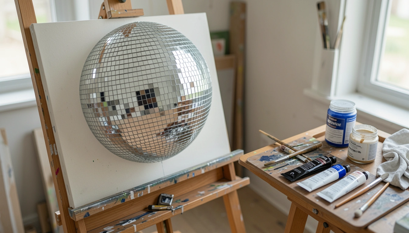
By the end you’ll have a convincing disco ball with reflections and glints. It’s doable with basic supplies and patience. Here’s how I do it, broken into 6 clear steps.
What You'll Need
- Canvas or panel (any size)
- Pencil and soft eraser
- Ruler or compass (for drawing the sphere and grid)
- Acrylic paints: titanium white, Payne’s gray/neutral black, ultramarine blue, phthalo green, cadmium yellow (or similar)
- Silver or metallic acrylic (or silver leaf if desired)
- Glazing medium or flow medium
- Assorted brushes: small round for highlights, flat for blocking, fan or dry brush for texture
- Small mixing palette, water jar, paper towels
- Optional: varnish
Step 1: Sketching and Blocking the Background
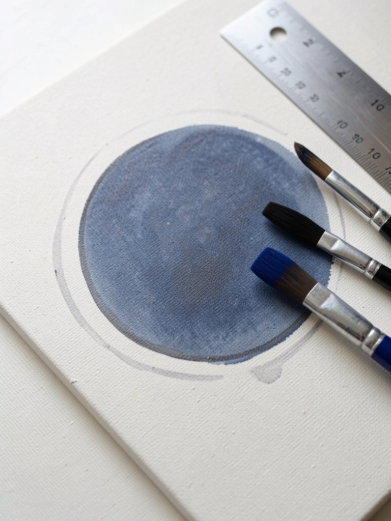
Start by lightly sketching the circle with a pencil and compass or by drawing a template. Block in a mid-to-dark background wash — dark navy or charcoal — so the silver reads against it.
When it’s going right, the background is smooth and even but not flat; mine looked streaky at first and that was normal. The dark background makes later highlights pop.
The main thing that goes wrong here is overworking the paint and muddying the tone. Keep the wash thin and let it dry before the next step.
Tip: thin the paint with glazing medium for an even wash and wipe stray graphite off gently before painting.
Step 2: Blocking In the Sphere and Major Values
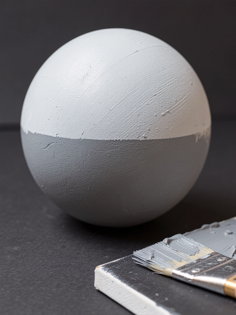
Mix a neutral mid-gray (white + a touch of black + a hint of blue). Paint the full circle as a flat base. Use a flat brush and keep the edges soft but defined enough to read the sphere shape.
At this stage my sphere looked patchy and that’s fine — value is what matters, not smoothness. Make sure you can see a light side and a shadow side.
What trips people up is losing the sphere’s form by making the edge too hard or too soft. Check with a squint to see the overall value pattern.
Tip: leave the very brightest spot unpainted or only thinly painted — that’s the later highlight.
Step 3: Mapping the Facets (Grid of Tiles)
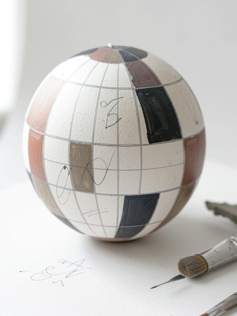
Draw the mirror-tile grid with light pencil. Use a ruler for the central bands and then curve the lines toward the sphere’s edges to suggest roundness. Keep tiles larger near the middle and smaller near the edge.
When it’s working, the grid reads spherical. Mine looked uneven at first; that’s normal — you’ll correct tiles with paint. The common error here is forcing perfect squares over a curved surface; they’ll look flat.
Tip: use a ripped cardboard template to test spacing, and don’t press hard with the pencil to avoid deep grooves when painting.
Step 4: Painting Mirrored Tile Values and Color Hints
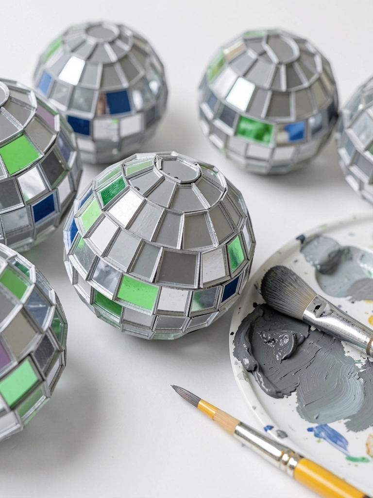
Paint each tile with a range of neutrals and tiny color shifts. Some tiles should be cool (blue/green), some warm (yellow/neutral), and many pure grays. Work one small area at a time and keep edges crisp between tiles.
I found the tiles look believable when values vary; my early attempts were too uniform and looked flat. The usual mistake is overblending and losing the hard edges of tiles.
Tip: use thin paint and a small round brush. If colors start to muddy, clean the brush and glaze a thin neutral over problematic tiles to reset them.
Step 5: Adding Crisp Highlights and Sparkle Points
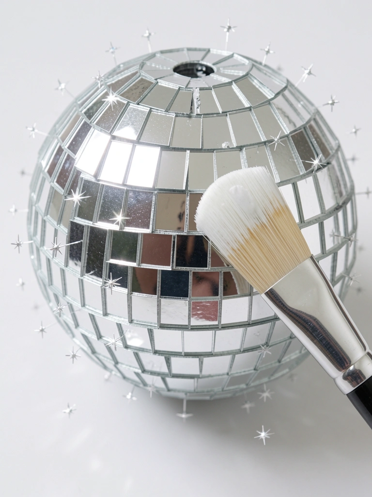
Use titanium white to place the brightest highlights on select tiles. Add tiny sparkles and starbursts around the ball where light would catch. Keep these very small — the eye reads sparkle more than size.
When it’s right, the white dots will sing. My first highlights were too big and looked cartoonish; scale matters. The big error here is over-highlighting everything, which flattens the effect.
Tip: load a fine brush and lift the brush slightly so the white sits on top; if a highlight is too harsh, soften its edge with a barely damp brush and a glaze.
Step 6: Glazing, Soft Glows, and Final Cleanup
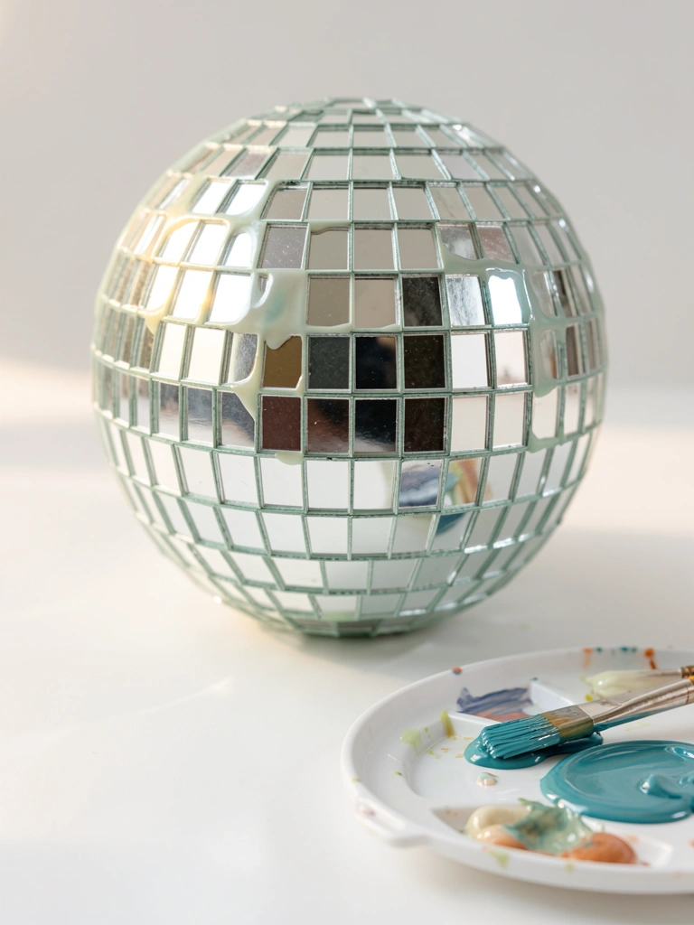
Thin a tiny amount of glazing medium with a touch of color for subtle reflections and a soft glow halo. Apply around the ball sparingly to imply bounced light. Clean up any stray pencil or smudges and sharpen a few tile edges to read the geometry.
My early pieces either had no glaze and felt flat, or too much and looked smeared. The common problem is overworking this step and killing crispness.
Tip: step back and view from a distance. If the glow looks right at arm’s length, it’s probably too strong. Finish with a protective varnish when completely dry.
Common Mistakes to Avoid
- Overworking the background wash and muddying the tone — fix by thinning paint and letting it dry between layers.
- Making every tile the same value — add small color shifts and varied grays to read mirror surfaces.
- Highlights that are too large or too frequent — place tiny, strategic whites and step back to check scale.
- Drawing a flat grid on a curved surface — curve lines toward the edges and test spacing with a template.
- Rushing glazes and smearing details — glaze thinly and let each layer dry before adding more.
Final Thoughts
This project taught me patience more than anything. The disco ball reads shiny because of contrast and tiny accents, not by cramming on metallic paint.
Your first try will have flaws. That’s part of learning the balance between crisp tiles and soft reflections.
Keep the notes from this session. I still refer to them when a piece looks too muddy or too busy.