How to Paint Waves with Realistic Motion
I ruined the first canvas by trying to paint every foam detail at once. It looked busy and flat.
I redid the background three times before the wave read like actual movement. That’s how I learned what matters.
This is the full walk-through I wish I’d had then. No fluff. You’ll finish with a painted wave that reads as motion, not just a shape.
How to Paint Waves with Realistic Motion
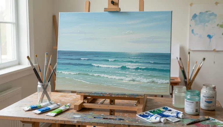
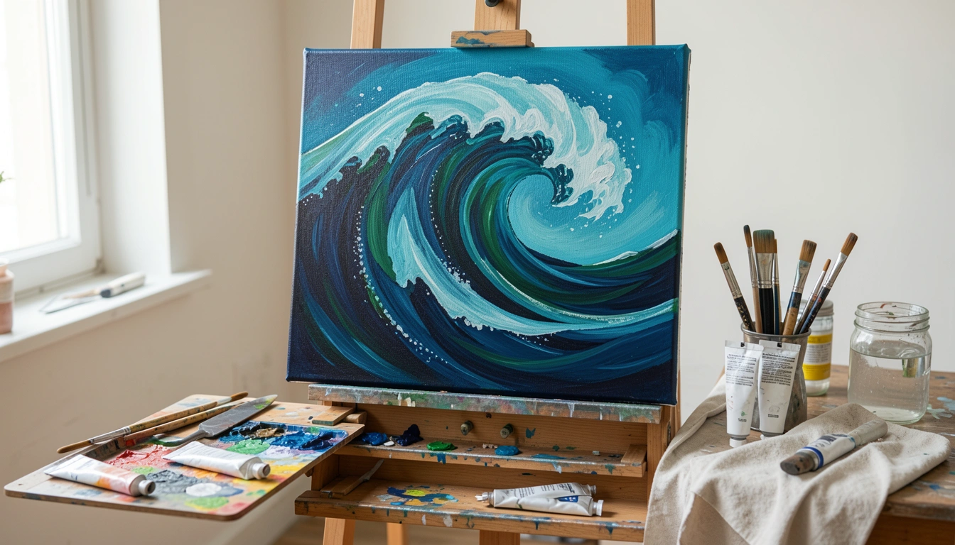
By the end you’ll be able to paint a single, convincing breaking wave with depth, foam, and spray. It’s doable even if you’re not advanced. Here’s how I do it, broken into 7 clear steps.
What You'll Need
- Medium-weight stretched canvas or canvas panel (gessoed)
- Acrylic paints: deep blue, green-blue (phthalo/cerulean), a cool dark (Payne’s gray or mixed), titanium white, touch of warm earth
- Palette and palette knife
- Brushes: large flat (1”), filbert (medium), round sizes 6–12, small round/detail, fan or dry brush
- Water jar, rags or paper towels, small sponge
- Acrylic glazing medium or flow improver and optional retarder
- Scrap paper or board for testing colors
- Toothbrush or stiff-bristle brush for splatter
Step 1: Prepare the Canvas and Block the Sky and Sea
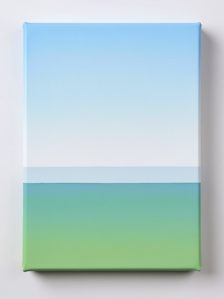
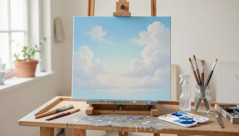
Stretch or prime your canvas if needed and decide the horizon height. Mix a soft sky gradient and paint it first, then block in the sea with a single, mid-value blue-green across the lower half.
When this reads right, the horizon stays calm and the wave will pop. My early pieces lost depth because the sky and sea clashed.
Watch for a hard, wobbling horizon—that will ruin perspective. Use a clean, straight edge or steady hand to fix it now.
Keep the sea slightly darker near the foreground. It’s easier to darken later than to recover lost light.
Step 2: Mix a Limited Wave Palette
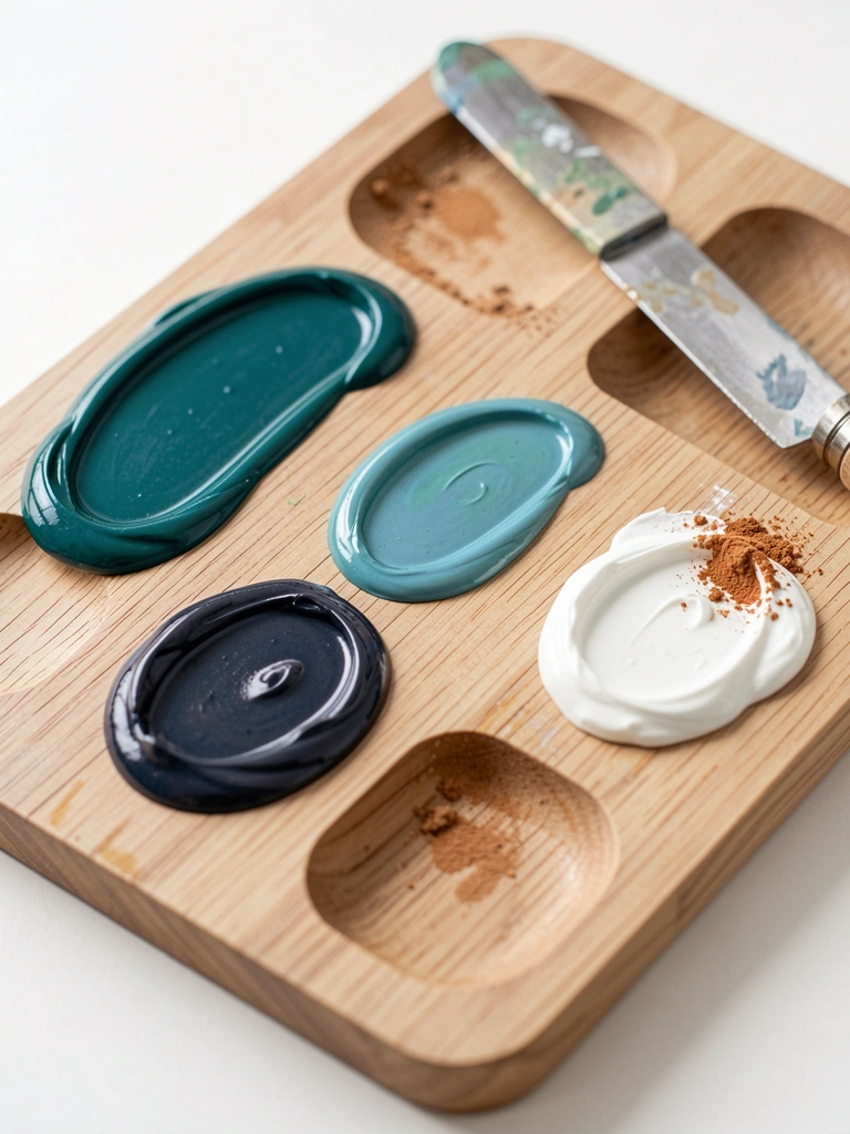
Put out a few puddles: a deep base (blue + a touch of green), a mid-tone with more green, a cooler dark for shadow, and plenty of white for foam. Keep a small warm earth nearby to mute whites when needed.
Test mixes on scrap paper. My mixes often went either too bright or muddy until I tested them on a surface.
The common trap here is overmixing until everything turns brown. Keep color pools separate and add tiny amounts of warm earth to tone whites, not to contaminate the whole palette.
Label or remember which puddle is which. It saves time and keeps edges from turning gummy.
Step 3: Block In the Large Wave Shapes and Values
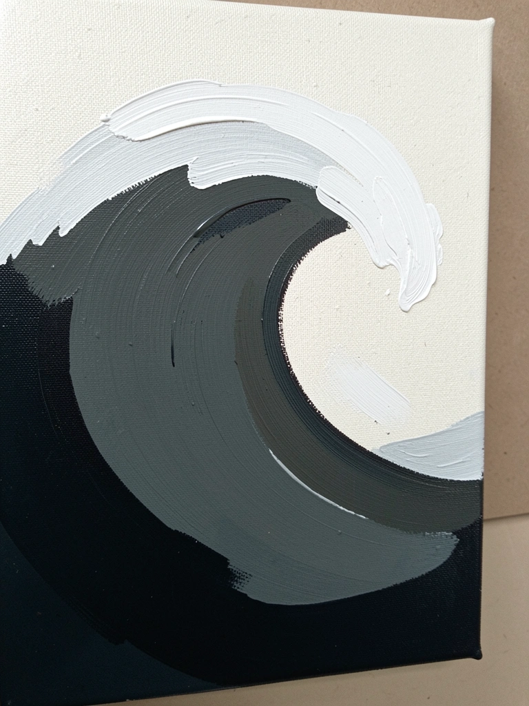
Using a large flat or filbert, sketch the main wave silhouette and block in three value bands: shadow, body, and crest. Work with thin paint so layers stay readable. Keep edges soft where the water curves inward.
At this stage the painting will look patchy and raw. That’s normal. I used to panic and overwork it.
The biggest mistake is losing contrast—everything becomes the same value. Step back and squint. If you can’t read the three bands, adjust the darkest and lightest now.
Don’t worry about foam yet. Treat this like sculpting form with paint.
Step 4: Sculpt the Wave with Directional Brushwork
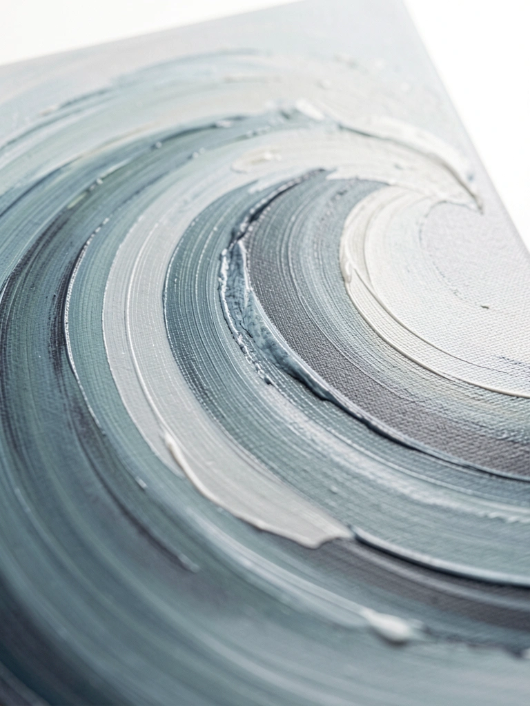
Use a filbert or round to add mid-tones and subtle gradients along the wave’s curve. Paint in the direction the water moves—long, curved strokes along the face and shorter, choppy strokes in the trough. Blend wet edges gently with a clean damp brush or a soft sponge.
When it’s right the wave reads as a curved plane. Mine often looked flat until I respected direction and light.
A frequent error is overblending. That kills energy and makes the water muddy. Clean your brush between strokes and use glazing rather than scrubbing.
Reserve the brightest whites for the crest and the light-catching ridges. They’ll sell motion later.
Step 5: Paint the Crest and Foam Shapes
Load thick-ish white and lay in the crest shape with a small round and fan brush. Use broken strokes to suggest foam folding over. Leave small areas of the underlying mid-tone visible to imply translucency.
The crest can go from looking too flat to too chalky. Mine often looked fake when I used straight pure white all over.
The usual mistake is painting opaque white everywhere. Break the whites with a touch of warm grey or glazing medium so the foam reads layered, not pasted on.
Use a toothbrush or dry brush to flick tiny specks for texture. Less is often more here.
Step 6: Add Spray, Splashes, and Translucent Lip
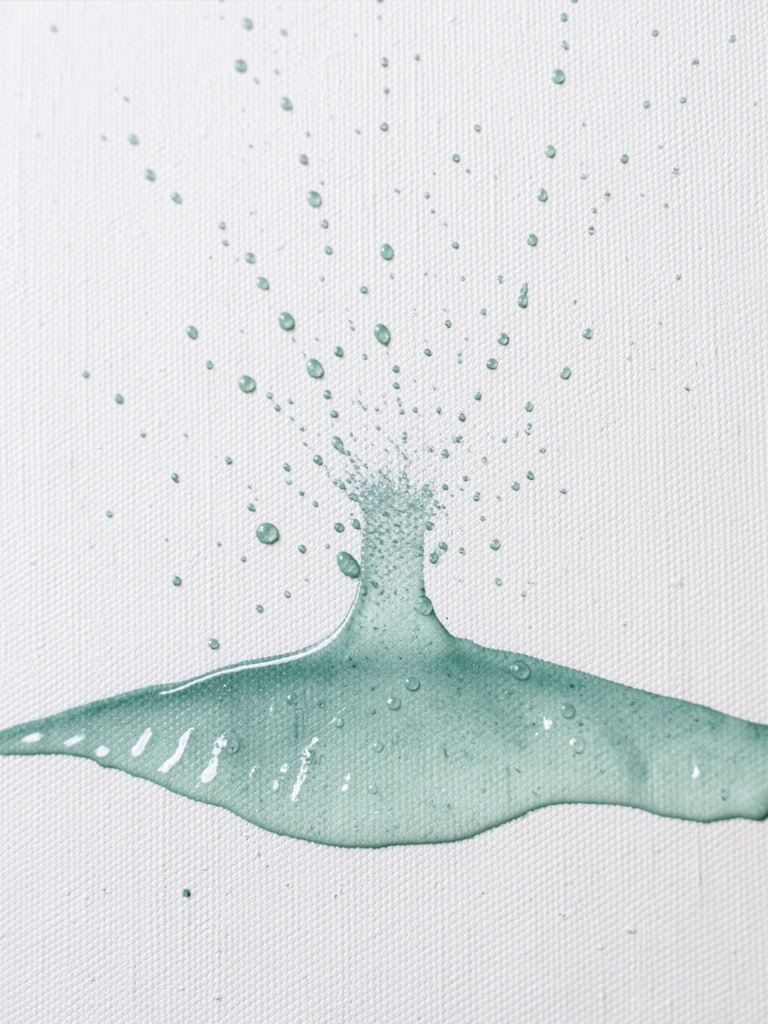
Thin a mid-tone slightly with glazing medium and paint a translucent lip beneath the crest to show water depth. Then, using a toothbrush or stiff brush, gently spatter white for spray. Add a few larger droplets with a fine round brush and let some overlap the sky and background for motion.
Spray can easily look random or excessive. My early work was overrun with specks and lost direction.
The trap is uncontrolled splatter. Tap your brush lightly and test on scrap until you can control scale. If a splatter is too big, soften it with a small glaze or dab with a damp brush.
Use contrast—bright droplets against darker shadow sell speed.
Step 7: Final Harmony, Edges, and Touch-Ups
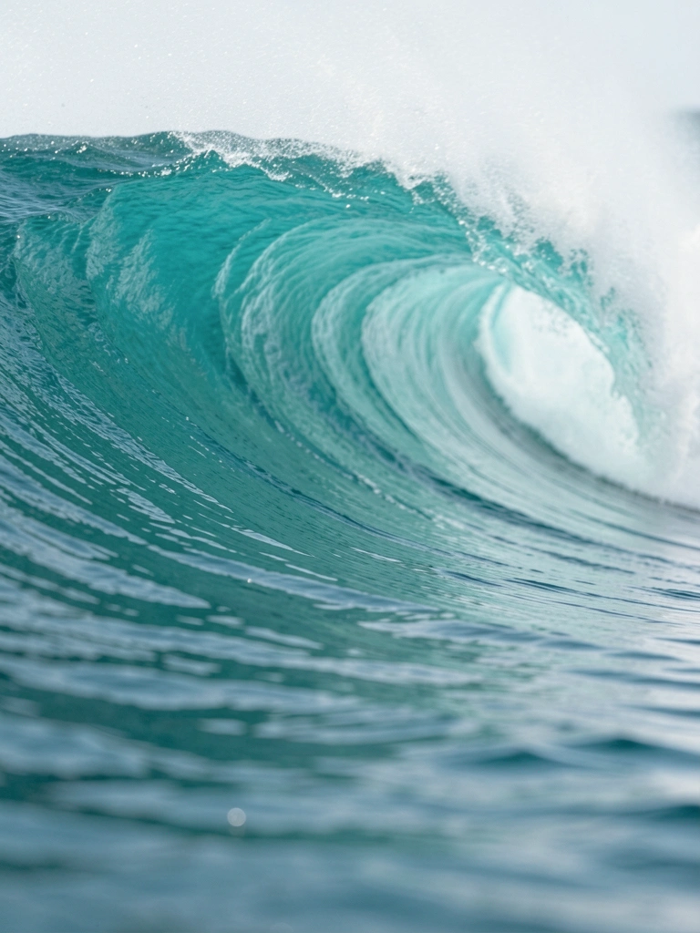
Step back and look for parts that read too hard or too soft. Soften distant edges with a thin glaze and sharpen a few foreground ridges with clean white to draw the eye. Adjust overall color with a very thin wash if the painting feels too warm or too cool.
My first attempts had disconnected areas because I didn’t unify the final pass. It felt like stitched pieces.
A common error is raising contrast too late or too much. Make subtle changes and compare them in daylight or in a photo.
When you’re happy, let it dry flat. Sign lightly where it won’t compete with the wave.
Common Mistakes to Avoid
- Painting every foam detail at once — finish the form first, then add foam in layers.
- Overmixing colors into a brown mess — keep separate pools and test on scrap.
- Using pure white everywhere for foam — break whites with a little warm gray for depth.
- Uncontrolled splatter for spray — practice on scrap and use light taps.
- Forgetting to check values by squinting — values sell form; fix them early.
Final Thoughts
Expect your first wave to look different from the example. Mine did too. That’s part of learning.
Focus on form, direction, and controlled highlights. The rest is practice.
You’ll get better fast by repeating this sequence and resisting the urge to detail too early.