How to Paint Mountains with Depth and Texture
I ruined my first canvas by over-blending every ridge into a muddy mess. I learned to step back, let layers dry, and keep edges purposeful.
I reworked backgrounds three times before getting believable distance. That taught me how to stage the painting.
This is a full walkthrough. I’ll take you from blank canvas to textured mountain forms you can be proud of.
How to Paint Mountains with Depth and Texture
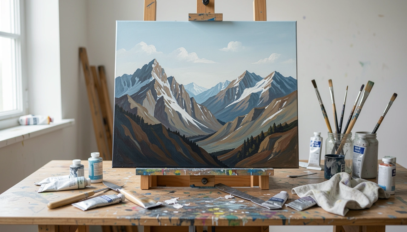
By the end you’ll have a layered mountain painting with believable distance, clear form, and textured highlights. It’s doable without fancy gear. Here’s how I do it, broken into 7 clear steps.
What You'll Need
- Stretched canvas or canvas panel (any small-to-medium size)
- Acrylic paints (white, ultramarine or phthalo blue, burnt sienna, raw umber, Payne’s gray or neutral gray)
- Acrylic glazing medium or slow-drying medium
- Large flat brush (1"–2"), medium filbert, small round brush, fan or dry brush
- Palette knife (metal) for texture
- Mixing palette or plate, water jar, rag or paper towels
- Pencil or charcoal for light sketching
- Masking tape (optional for clean horizon)
Step 1: Light Sketch and Block the Horizon
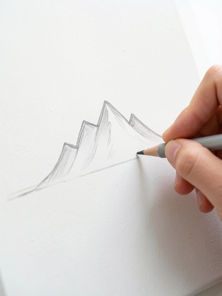
Start with a light sketch to map the horizon and major mountain masses. Keep it simple—no detail yet. I usually use a soft pencil and block the biggest shapes.
When it’s going right, the sketch feels like a roadmap, not a finished drawing. My early attempts were too detailed, which trapped me into small mistakes later.
A common slip here is pressing too hard with the pencil. That makes marks hard to hide under thin paint—use a light hand or charcoal you can wipe.
Tip: think in wedges and silhouettes. I keep the sketch faint so paint can read the forms.
Step 2: Paint the Sky and Atmospheric Background
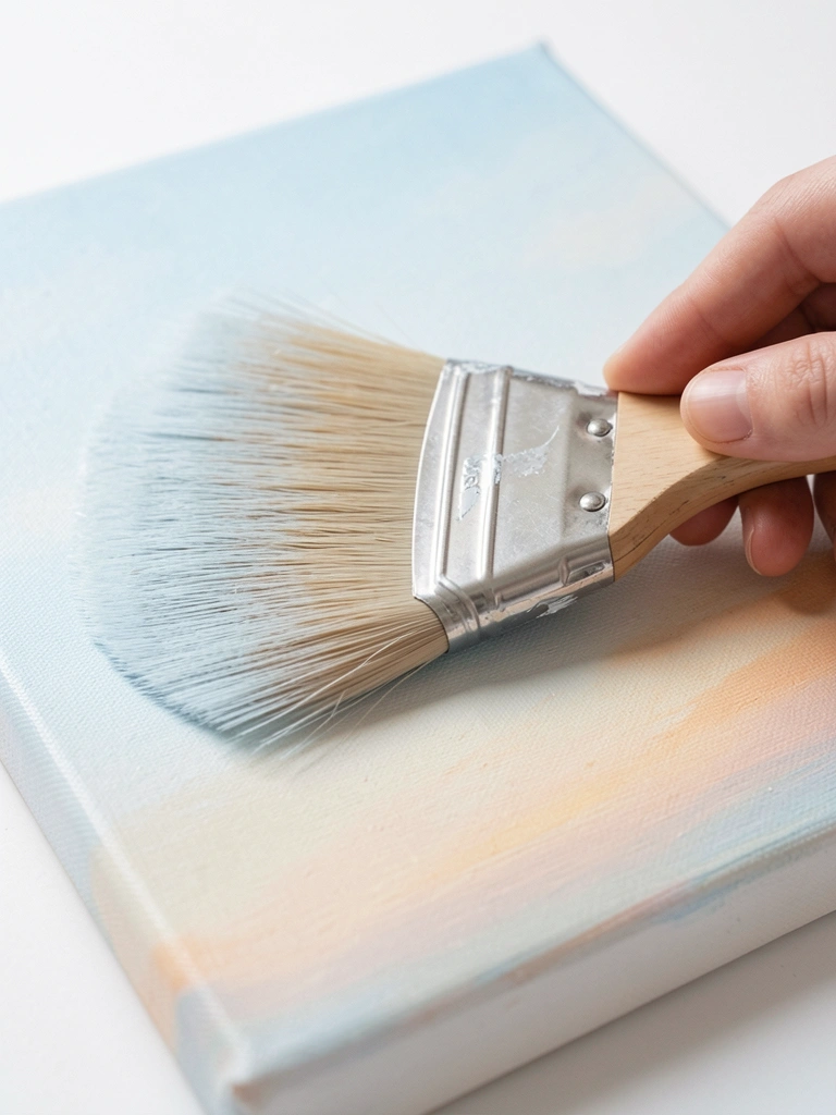
Block in the sky first. Use a large flat brush and a smooth gradient from lighter at the horizon to deeper aloft. Work wet-on-wet quickly with acrylic—thin paint and a touch of glazing medium slows drying.
When it’s right, the sky reads soft and seamless. Mine often looked streaky at first, and that’s normal—go back with a damp brush to even it before it skins over.
What goes wrong here is overworking the sky until it gets streaky or patchy. If that happens, let it dry and glaze a thin, even layer later.
Tip: keep the horizon slightly warmer and paler to push mountains back.
Step 3: Block In the Distant Mountain Masses (Light Values)
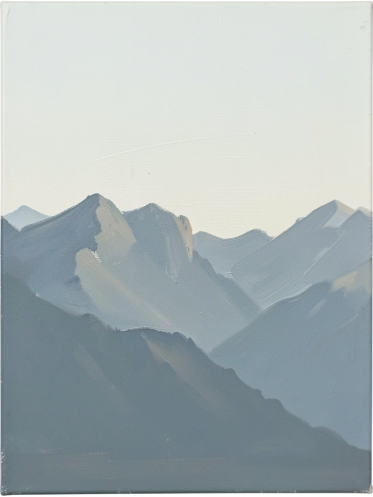
Mix a cool, muted value for distant mountains—more blue and white, less saturated. Use thin paint and a soft edge so they sit back in the scene. Paint the whole mass before any details.
When correct, these shapes read faint and soft. My first layer often looked too dark and fought the sky—remember distance is lighter and cooler.
What trips people here is adding contrast too early. If your distant mountains are as contrasty as the foreground, everything flattens.
Tip: test your distant color next to the sky on the palette. If it disappears, it’s probably right.
Step 4: Establish Midground Forms and Midtones
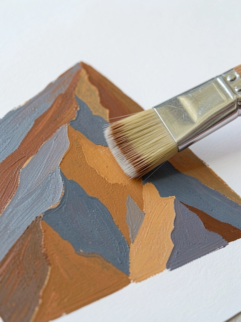
Block the midground with slightly warmer, stronger values. Think of planes catching light and shadow. Use a filbert or round to suggest angled faces, not detailed textures yet.
When this is working, the mountain feels more solid. Mine often read patchy at this point because I tried to blend too much while the base was still wet.
The usual failure is muddy color from mixing too many pigments on the canvas. Clean mixes on the palette and apply thin layers to avoid muddiness.
Tip: leave some unpainted sky edges for crisp ridgelines later. That contrast helps depth.
Step 5: Sculpt Form with Shadows and Hard/Soft Edges
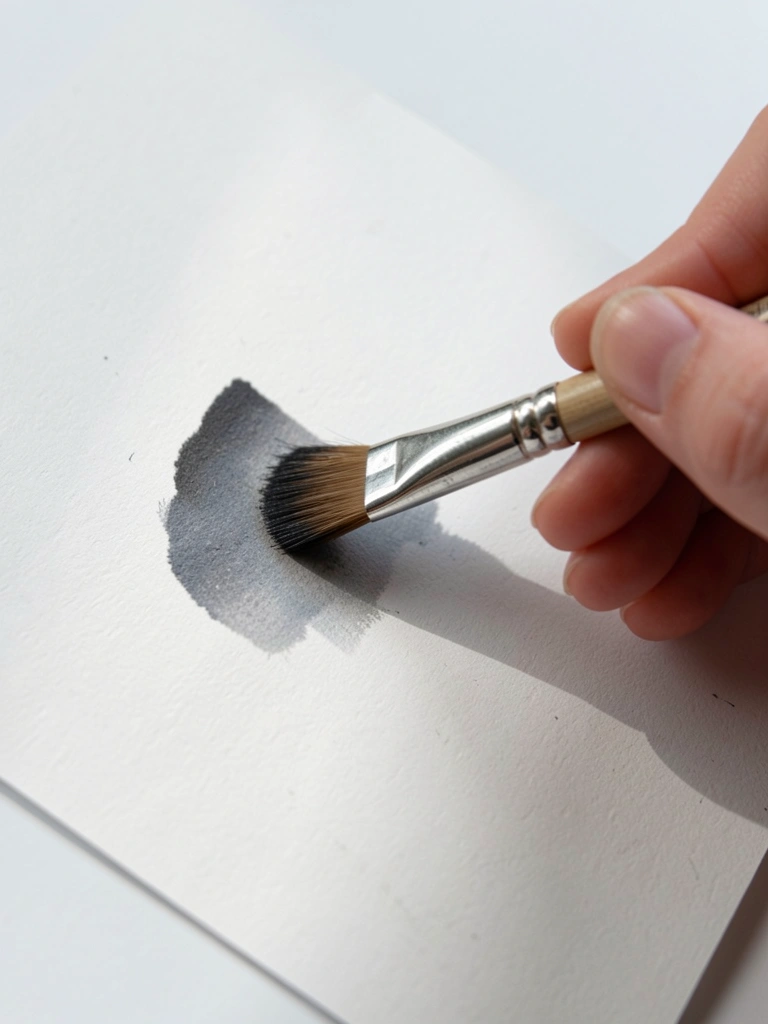
Now define light and shadow with darker local mixes. Use hard edges on forward ridges and soft, feathered edges where the mountain recedes. Alternate a drier brush for crisp lines and a slightly wetter brush to push edges back.
When I do this right, planes feel carved. My early attempts had too many hard edges that flattened the view. That’s normal to fix.
People often overwork shadows until colors go muddy. Catch it by stepping back and comparing values, not colors.
Tip: keep one clean reference value for your darkest shadow to anchor the scene.
Step 6: Add Texture—Dry Brushing and Palette Knife
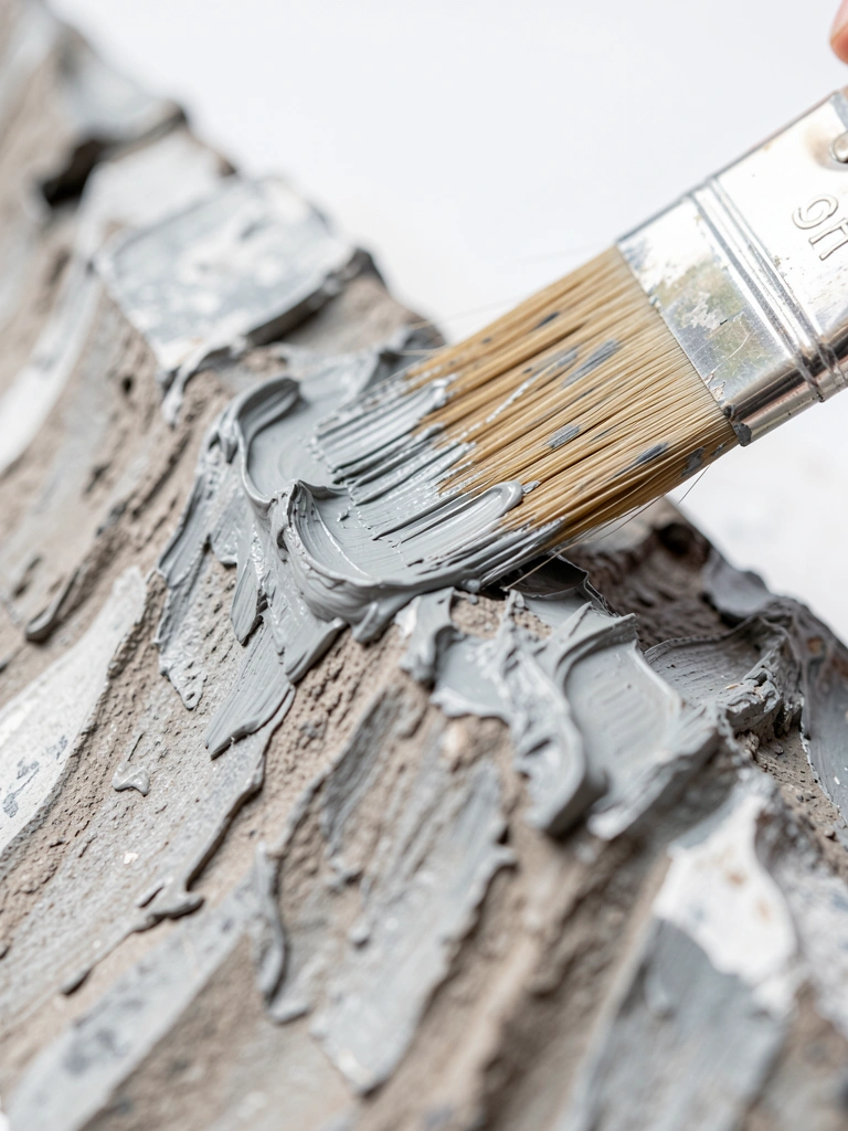
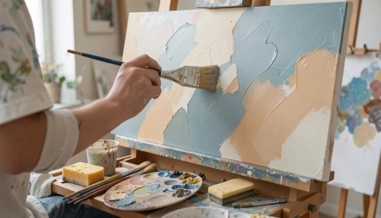
Introduce texture deliberately. Use a palette knife for rocky ridges and a dry brush or fan to suggest scree and grasses. Work in small areas so textures read, not overwhelm.
My first texture layer looked forced and noisy. That taught me to step back and apply texture sparingly where the eye needs it.
A common mistake is using too much paint or the wrong consistency—thick knife paint should be fresh; dry brushing must be low-medium viscosity. Test on a scrap.
Tip: scrape a little paint off the knife for thin ridges. Less is usually more.
Step 7: Final Glaze, Highlights, and Unify
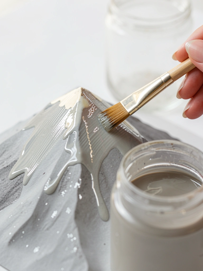
Finish with a thin glaze to cool or warm areas and soft highlights on ridges with titanium-white mixed sparingly. Use a small brush for crisp highlights and a soft brush to glaze across transitions.
When it’s right, the painting feels unified. My final glazing often rescued overly stark transitions and made the scene cohesive.
What goes wrong here is over-highlighting. Too many bright strokes make the work look busy. Place highlights with intention.
Tip: step back frequently. If a glaze flattens contrast, lift a touch of highlight to restore form.
Common Mistakes to Avoid
- Over-blending early: paint becomes muddy — fix by letting layers dry and glazing thinly.
- Adding too much detail too soon: flattens depth — fix by working large-to-small and holding details for later.
- Trying to match every color on the canvas: causes muddiness — fix by mixing on the palette and testing values against the painting.
- Heavy-handed texture everywhere: looks noisy — fix by applying texture selectively where it supports form.
Final Thoughts
This method broke down how I go from blank canvas to layered, textured mountains. It takes patience and a few intentional passes, not one heroic brushstroke.
Your first version will look different from mine. That’s how you learn what each step does.
Keep the shapes bold, the edges purposeful, and treat texture as punctuation. You’ll finish something that reads like mountains, and you’ll know how to improve the next time.