13 Charming Plant Pots Painting Ideas for Every Style
I once ruined three pots trying to copy a tutorial that ignored drying times.
I learned faster by wrecking a few canvases and redoing backgrounds.
Now I know what actually works for plant pots: simple, forgiving tricks you can try tonight.
These are things I use when I want quick charm without wasting paint.
13 Charming Plant Pots Painting Ideas for Every Style
These 13 practical painting ideas are things I actually tried and kept. I show what changed and what to watch for. You get 13 clear techniques you can try now.
1. Terracotta Base Wash for Instant Warmth
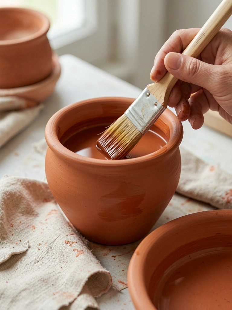
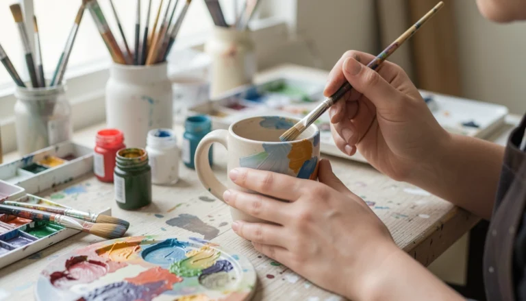
I started by thinning burnt umber and sienna into a watery wash. It let the clay texture show through while unifying the pot’s tone.
The pot looked like it belonged on a sunlit windowsill right away.
Watch the drips—keep the brush loaded but not dripping, and tilt the pot to control runs.
Tip: if the wash pools, blot quickly with a paper towel so you don’t get hard edges.
What You'll Need for This
- Student-grade acrylics (burnt sienna, raw umber)
- Flat synthetic brush
- Water jar and rag
- Unglazed terracotta pot
2. Two-Tone Dip-Dye Gradient (No Tape)
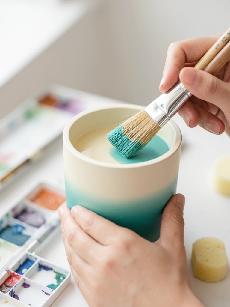
I used a wet-on-wet blend along the rim to get a soft dip-dye look. I used more water than I expected and learned the hard way—too much made colors run into muddy mixes.
Once I adjusted to less water, the gradient stayed smooth.
Work quickly and pull the brush through the join while both paints are slightly damp.
If you want cleaner edges, practice the motion on scrap paper first.
What You'll Need for This
- Acrylics (two contrasting colors)
- Round synthetic brush (size 6–10)
- Water jar and scrap paper
- Optional small sponge
3. Loose Leafy Silhouettes for a Painterly Look
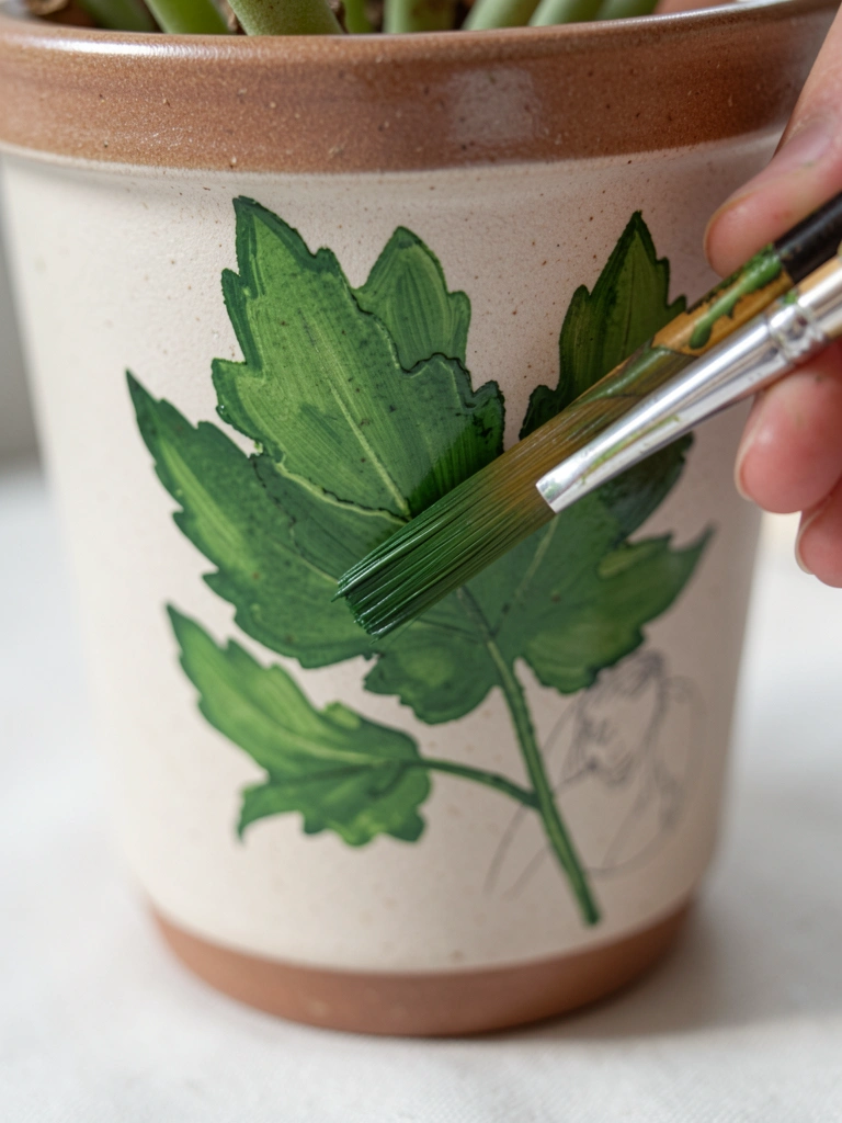
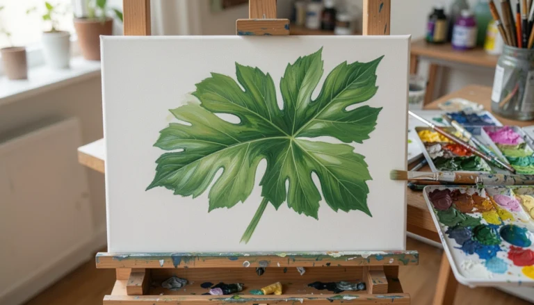
I started sketching leaves with a pencil, then painted quick, loose strokes with a filbert. The trick was not overworking each leaf—leave edges soft or they look stiff.
My early attempts were too detailed; simplifying the shapes made the pot feel fresher.
Vary the pressure on the brush to get thin stems and fuller leaves in one stroke.
Don’t fuss—those little imperfections make it feel hand-painted.
What You'll Need for This
- Acrylics (various greens)
- Filbert or round brush
- Pencil for light sketching
- Terracotta or ceramic pot
4. Chalky Matte Finish with Light Sanding
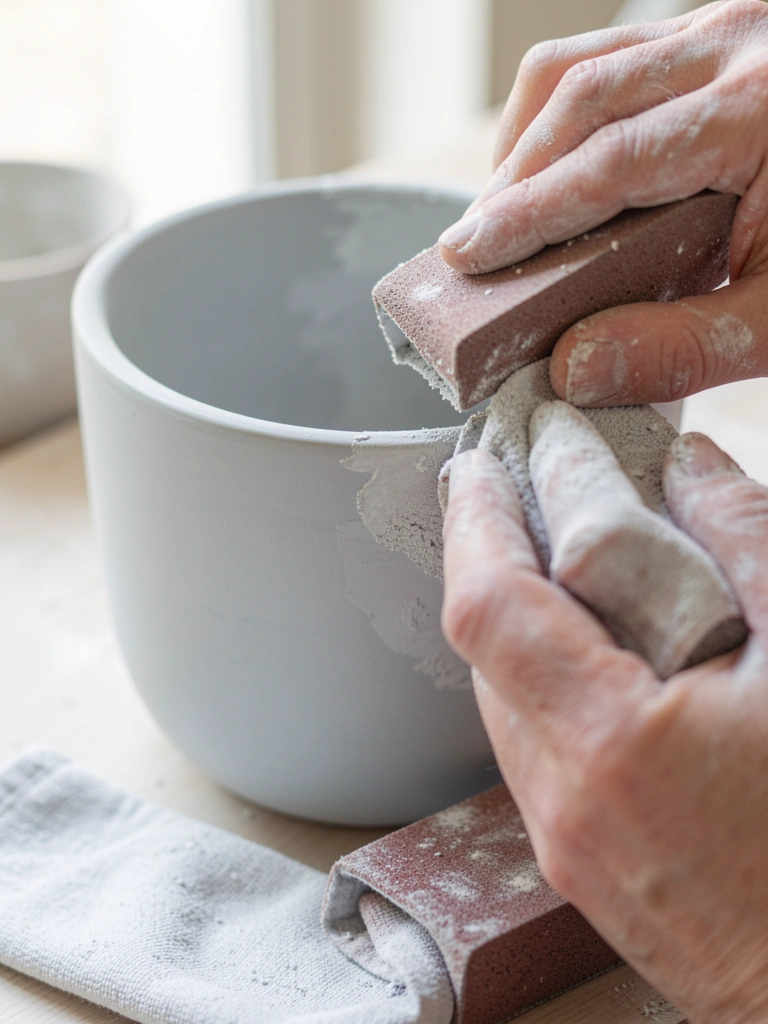
I switched to a chalky finish when I wanted a soft, muted look. After two coats, I sanded edges lightly to reveal the clay beneath.
Be gentle—sand too hard and you’ll create a visible groove.
This finish hides brush strokes and feels forgiving when your blending isn’t perfect.
Seal with a matte varnish if the pot will be outdoors.
What You'll Need for This
- Chalk-style paint
- Fine sanding block or paper (220–320 grit)
- Soft cloth
- Matte acrylic sealer (optional)
5. Tiny Botanical Stamps for Repeatable Detail
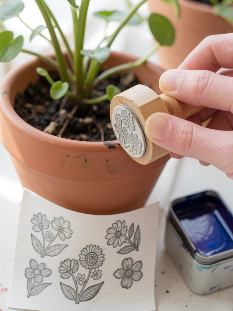
I carved a tiny leaf stamp from eraser block and used it to repeat motifs around a pot. It saved me time—but my first stamps were too wet and smeared.
Once I dabbed excess paint off, the prints stayed crisp.
Stamps give you consistent patterns without needing steady freehand skills.
Practice on paper to check pressure before you stamp the pot.
What You'll Need for This
- Carving block or small stamp
- Acrylic paint for stamping
- Small foam pad or brush for inking
- Pot with primed surface
6. Painterly Glaze Stripes for Depth
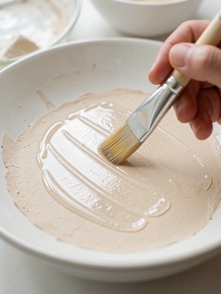
I thinmed color with glazing medium to layer translucent stripes. Each stripe added depth without covering the base.
At first I applied stripes too close together and it felt busy; spacing them out calmed the design.
Keep the glaze thin so it blends into the base. Build up slowly.
This is forgiving—if you don't like a stripe, wipe it while wet and try again.
What You'll Need for This
- Acrylics and glazing medium
- Soft flat brush
- Mixing cup
- Primed pot
7. Palette Knife Texture for Rustic Pots
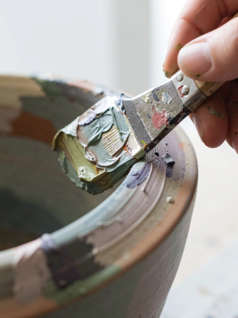
I used a palette knife to add rough, organic textures around a pot rim. It felt like sculpture and hid uneven brushwork.
My first pass was too heavy and made the pot unstable; lighter lifts worked better.
Scrape, press, and lift—the knife gives you broken edges and tactile interest.
Let thick areas dry fully before moving the pot.
What You'll Need for This
- Heavy-body acrylics or modeling paste
- Palette knife
- Disposable palette
- Sturdy pot or panel
8. Pottery-Style Speckle with Toothbrush Flicks
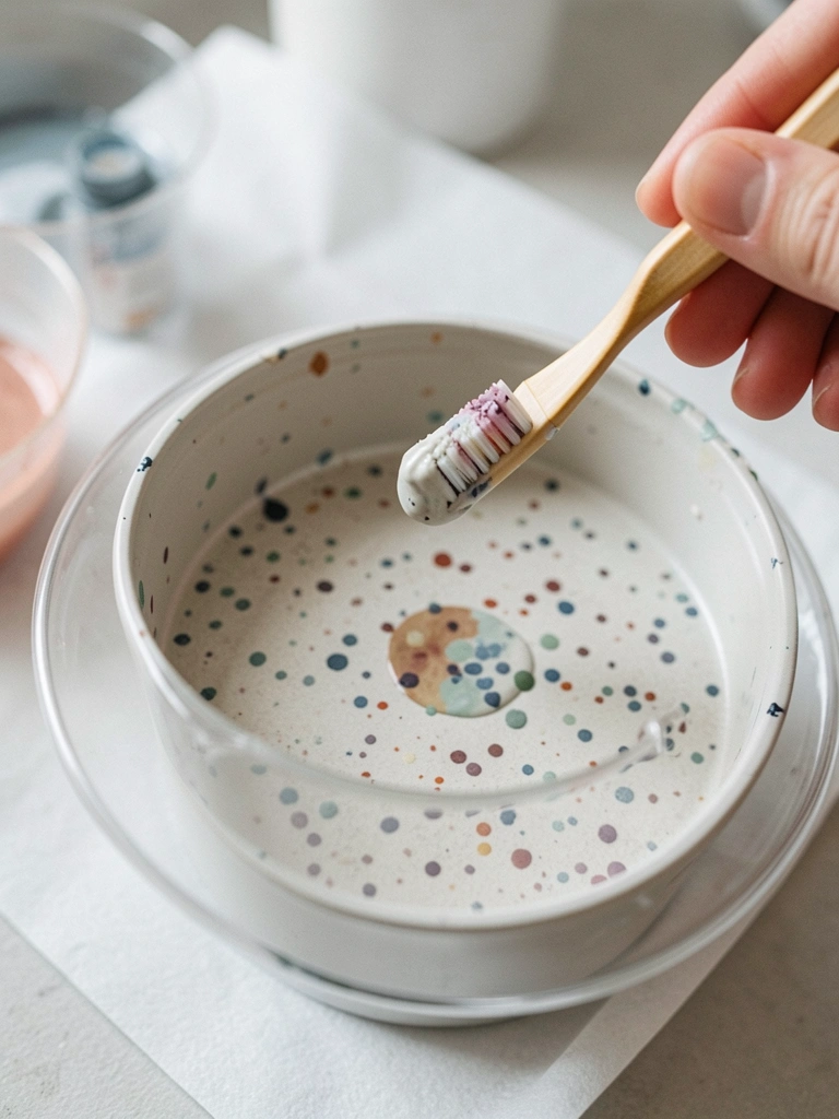
I learned speckle by flicking thinned paint with a toothbrush. My first attempt was too heavy and looked accidental, so I watered the paint more and practiced on scrap.
Speckle makes the pot look handmade and hides small mistakes.
Mask areas you want clean with tape or paper before flicking.
Work in layers—light passes build a natural speckle without overpowering the base.
What You'll Need for This
- Thinned acrylic paint
- Old toothbrush or stiff-bristle brush
- Masking paper or tape
- Protective drop cloth
9. Negative-Space Leaf Masks for Crisp Shapes
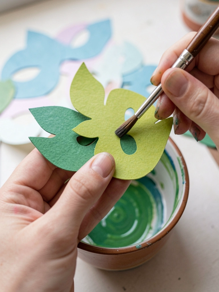
I cut leaf shapes from paper and stuck them to the pot, then painted the background. When I removed masks, the leaves were clean and sharp—no freehand needed.
Be careful with edges; press masks down firmly so paint doesn't bleed underneath.
This trick is great when you want bold, graphic plants without perfect brush control.
Remove masks while paint is tacky, not bone dry, to avoid pulling the paint.
What You'll Need for This
- Masking paper or frisket film
- Craft knife and cutting mat
- Flat brush for background
- Acrylic paint
10. Metallic Rims and Feet for Polished Detail
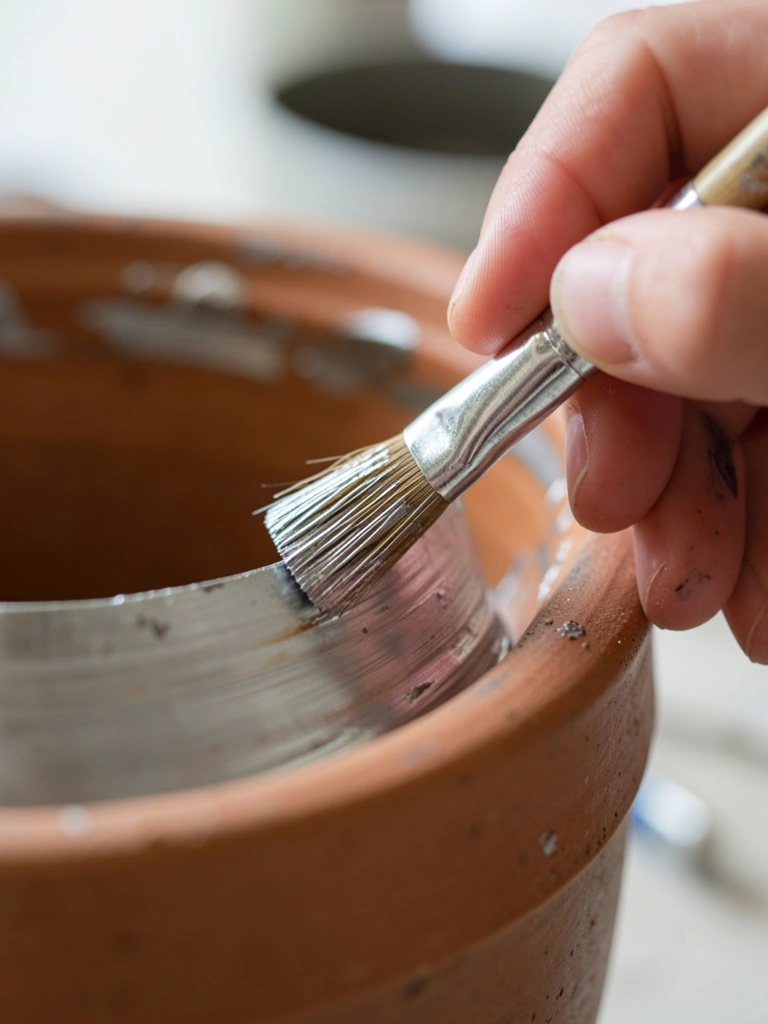
I add a narrow metallic band to rims or pot feet to raise a simple design. A small round brush and steady wrist make a neat line.
I once tried gold over a textured surface and it looked patchy; smooth the area first for shine.
If the metallic feels too bright, dull it slightly with a thin matte glaze for balance.
Metallics accept a lot of forgiveness—tiny chips can look intentional.
What You'll Need for This
- Metallic acrylic paint
- Small round brush (size 0–2)
- Fine sandpaper (optional)
- Cotton swab for cleanup
11. Mid-Century Abstract Color Blocks
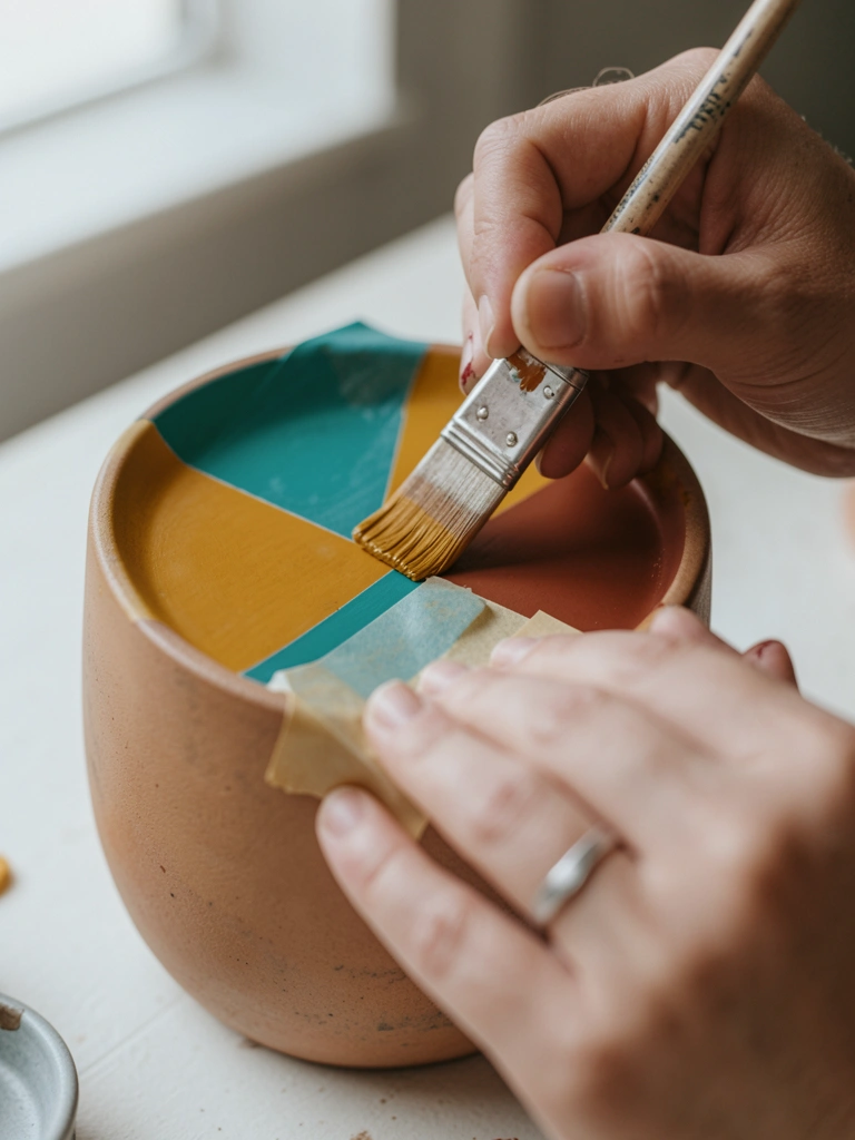
I taped off bold blocks and used a muted palette for a mid-century vibe. Early attempts had uneven tape lines because I used cheap tape; switching to low-tack paper tape solved it.
Block shapes make a small pot read like a designed object.
Keep layers thin and sand between coats for crisp joins.
Let each color dry completely before removing tape to avoid lifting paint.
What You'll Need for This
- Acrylics in 3–4 colors
- Low-tack painter’s tape
- Small foam roller or flat brush
- Sanding sponge
12. Watercolor-Like Acrylic Washes for Soft Pots
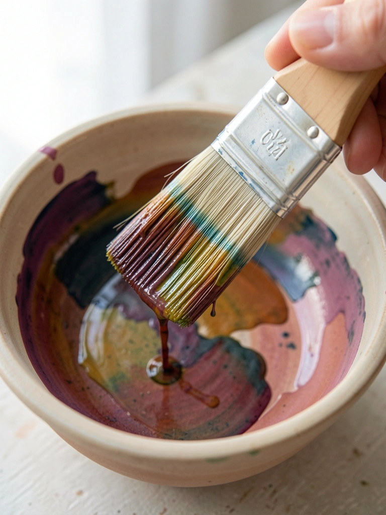
I watered acrylics to behave like watercolor, letting pigments flow and stain the surface. The first time I used too much water and the color separated oddly; I learned to mix enough binder or glazing medium.
This gives soft, layered color that reads as delicate.
Work on a primed or gessoed pot so the wash absorbs evenly.
Build color slowly—multiple light washes beat one heavy pour.
What You'll Need for This
- Acrylics and glazing medium or water
- Large soft round brush
- Gesso or primed pot
- Paper towels
13. Dry-Brush Weathered Edge for Vintage Feel
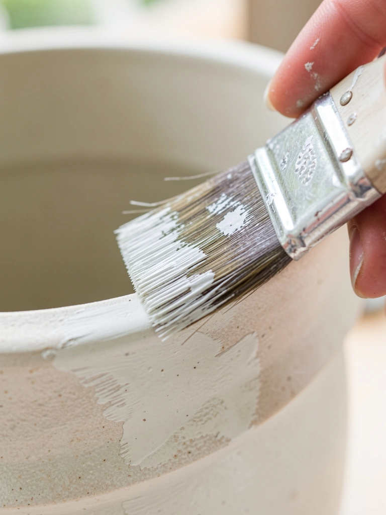
I dry-brushed a lighter color along edges to fake age. Use almost no paint on the brush—if it’s loaded, you’ll get streaks instead of subtle wear.
This hides small chips and gives a lived-in look without actual distressing.
Test the motion on scrap to get the right drag and pressure.
It’s quick, forgiving, and makes pots feel like they belonged in an old greenhouse.
What You'll Need for This
- Acrylic paint (lighter shade)
- Stiff flat brush or old toothbrush
- Scrap paper for testing
- Soft cloth
Final Thoughts
I don’t expect you to master all of these at once. I picked what I actually used after more ruined pieces than I’d admit.
Try one or two techniques, keep a test pot nearby, and accept a few mistakes.
Painting pots should feel like a small, satisfying practice—use what sticks and keep the rest for later.