
8 Elegant Pillar Painting Ideas for a Stylish Home
I ruined a pillar once by rushing the base coat.
I redid it three times before the finish sat right.
What stuck was simple: plan the layers, and control the paint.
These ideas come from those messy re-dos. They’re practical. You’ll see what to try first.
8 Elegant Pillar Painting Ideas for a Stylish Home
These 8 pillar painting ideas are hands-on and realistic. I include what worked for me and what didn’t. Try one at a time; each idea is ready to pick up a brush and use.
1. Faux Marble Veining for a Sophisticated Pillar
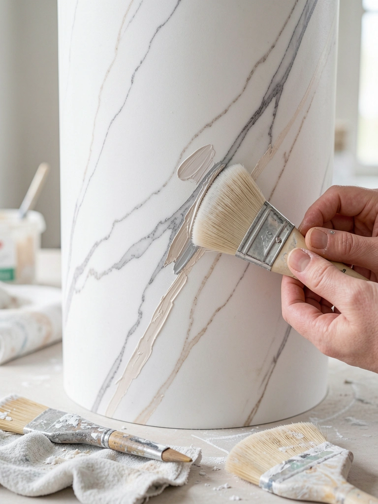
I tried faux marble after a tutorial that made it look instant. It wasn’t. My first veins were too harsh and made the surface look fake. Slowing down and glazing thin veins over a muted base made it read as stone instead of paint.
I let each glaze dry and then softened edges with a barely damp brush. That subtle blur is what sells it.
Pay attention to scale. Big, soft veins work better on large pillars than tiny, busy lines.
What You'll Need for This
- Acrylic paint in white, gray, beige
- Soft round and fan brushes
- Glazing medium or thinned acrylic
- Damp rags or sponge
- Sandpaper (fine)
2. Vertical Ombre Wrap for a Soft, Blended Look
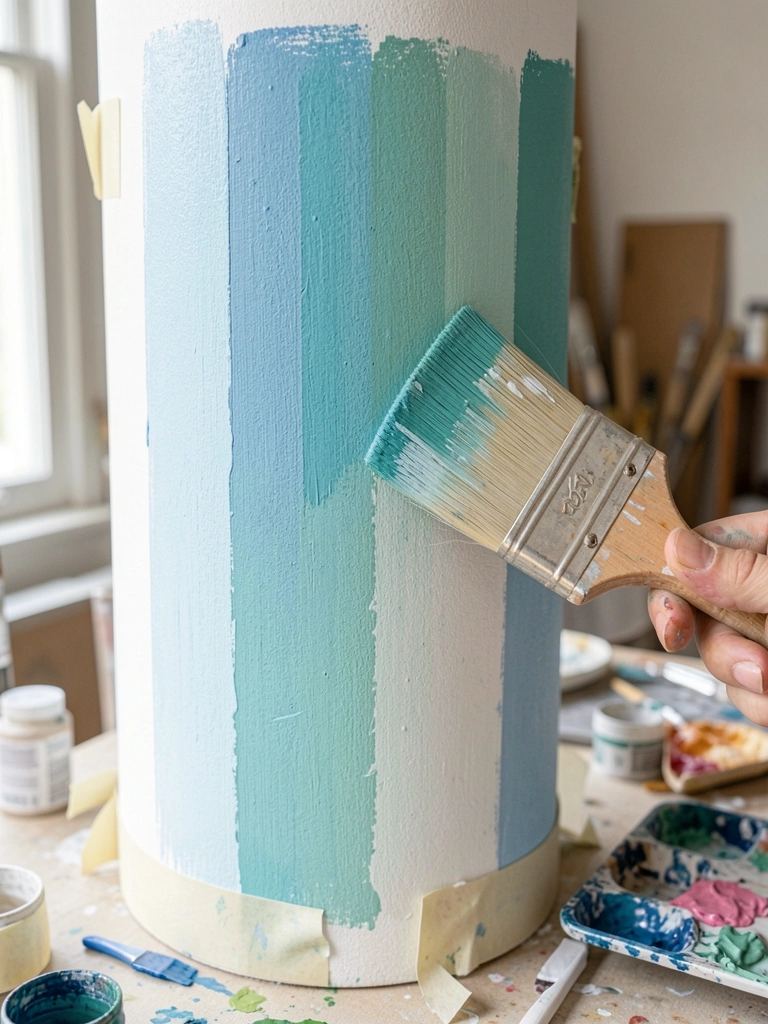
I used to overwork gradients and got muddy colors. The trick I learned was to mix each transition color on the palette first. Then I painted long vertical strokes while the paint was still wet to push edges together.
Work top-to-bottom in sections. I let the lower area remain slightly wet before blending upward. That keeps the gradient smooth and avoids streaks.
Watch drying times. Acrylics skin over fast; a slow-drying medium helps if you want longer blend time.
What You'll Need for This
- Acrylic or latex paint
- Wide flat brush or soft roller
- Slow-drying medium (optional)
- Palette or mixing tray
- Clean water and rags
3. Textured Stucco Finish with a Palette Knife
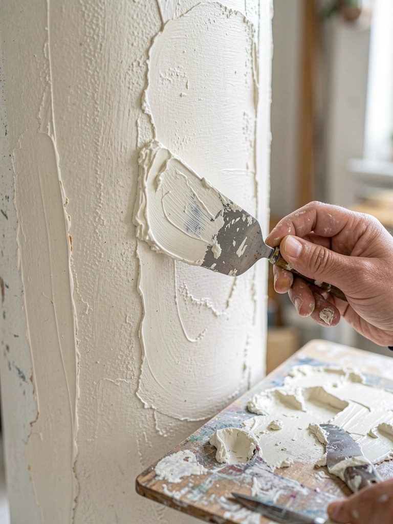
I tried sponging and ended up with uneven blotches. Using a palette knife gave me intentional texture without the randomness. I worked thin layers and built them up where I wanted shadow and catch.
This approach hides small surface flaws and reads as handcrafted. I avoided overworking the knife strokes; subtlety wins.
Test on a scrap first. Too much pressure makes the texture look clumsy. Keep the strokes varied and light.
What You'll Need for This
- Heavy-body acrylic or joint compound thinned for paint
- Palette knife or flexible trowel
- Drop cloths
- Sandpaper for smoothing between layers
4. Gilded Accents for Subtle Shine
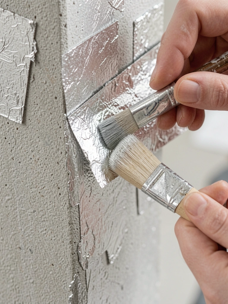
I once slapped metallic paint on and it read cheap. Metal leafing taught me restraint. I applied it only to fluting or the top and bottom caps of the pillar.
A little gilt goes a long way. I sealed it gently to avoid flaking. The result reads elegant because it catches light without shouting.
Prep is key. The surface must be smooth and tacky for the leaf to adhere cleanly.
What You'll Need for This
- Metal leaf or metallic acrylic paint
- Soft adhesive (size) for leafing
- Soft brushes and cotton gloves
- Sealer or varnish
5. Fluted Trompe-l’œil to Mimic Classical Columns
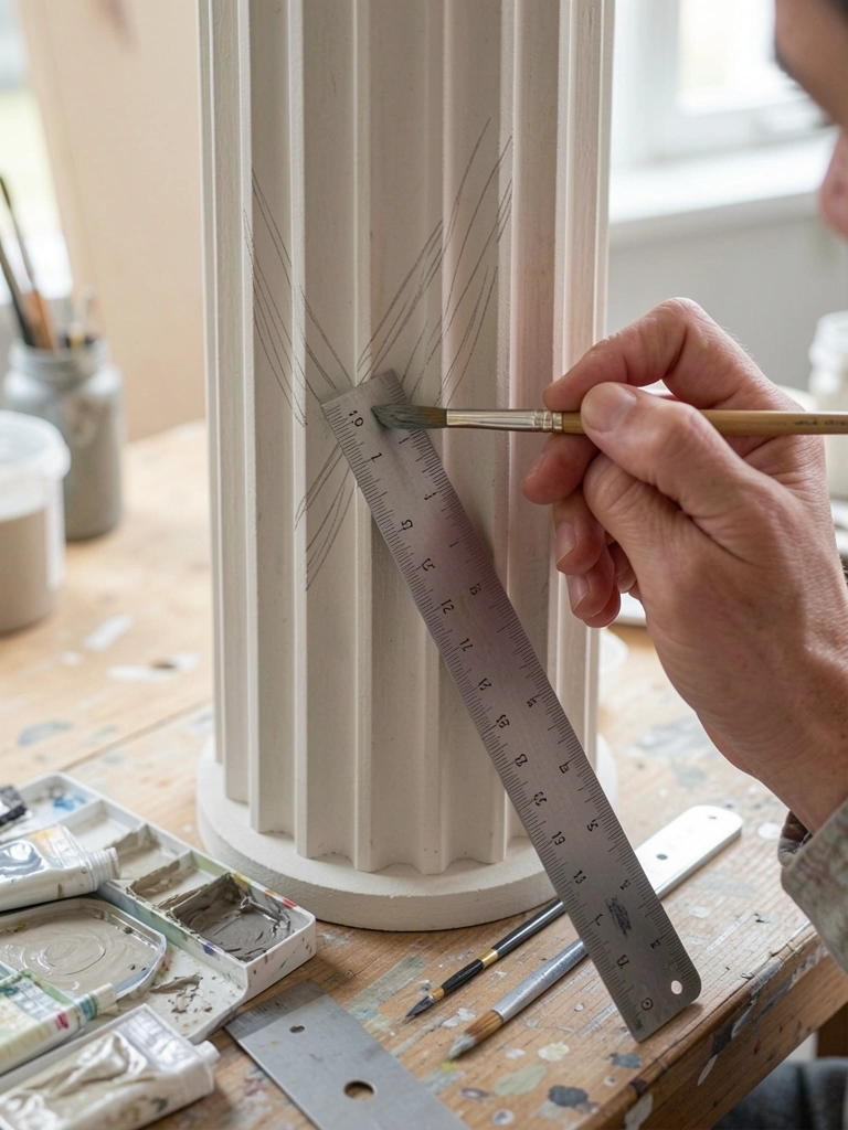
I botched my first flutes by going freehand. They warped. A chalk line and a ruler made my fluting believable. Light and shadow matter more than exact symmetry.
I painted soft shadows inside each groove and a faint highlight on the edge. That small contrast reads like depth.
Don’t over-contrast. Too dark shadows look carved rather than painted. Keep it gentle and repeatable.
What You'll Need for This
- Chalk or pencil for layout
- Liner brush and soft flat brush
- Neutral paints for base, shadow, and highlight
- Straightedge or ruler
6. Botanical Banding with Stencils for a Fresh Detail
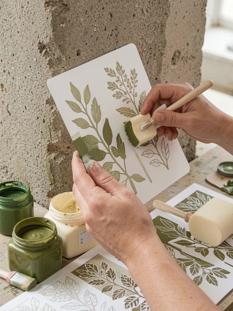
Stencils felt safe until I tried one with too-thick paint. It bled under the edge and looked messy. Dry pouncing with a foam tool fixed that for me.
I lay out a repeating band at eye level to anchor the room. I used two tones—not a stark contrast—to keep it soft and cohesive.
Practice the pressure on scrap first. Light taps build the pattern without seepage.
What You'll Need for This
- Stencil templates
- Foam pouncers or small round brushes
- Paint in two coordinating tones
- Low-tack tape for positioning
7. Two-Tone Color Blocking for Modern Contrast

I once matched colors in poor light and regretted it later. I now tape crisp bands and test swatches in the room’s light first. Two balanced tones can read modern and calm.
I keep the lower tone slightly darker to ground the space. A thin gap of trim paint between bands gives a crisp, intentional break.
Take your time with tape. Pull it when the paint is tacky, not fully dry, for cleaner edges.
What You'll Need for This
- Painter’s tape
- Two paint colors (tested in-room)
- Small roller and angled sash brush
- Drop cloths
8. Painted Scene Wrap for a Statement Pillar
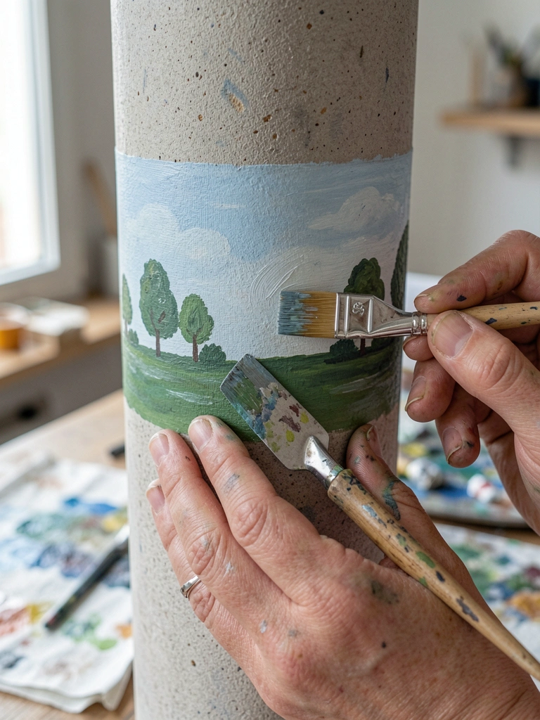
I tried a complex mural and gave up halfway. Later I simplified to a narrow wrap—just a horizon band or silhouette. It reads intentional and keeps the pillar from overpowering the room.
I sketch lightly, then paint in layers. I learned to stop when the forms read clearly rather than when every detail is finished.
Start small. A repeatable motif around the pillar is easier than a full scene and less likely to go wrong.
What You'll Need for This
- Pencil for sketching
- Small round and filbert brushes
- Acrylic paints in muted tones
- Ladder or step stool for reach
Final Thoughts
I’ve ruined and remade pillars enough to know patience matters.
Pick one idea and do a small test on cardboard or scrap wood first.
You’ll learn faster by doing than by planning forever. Keep the strokes light and the mistakes visible—those teach the most.