How to Paint Clouds for Soft Realistic Skies
I ruined my first few canvases trying to get soft clouds. I kept ending up with muddy blobs or hard, chalky edges.
I finally worked out a repeatable process that respects paint drying and blending. This is the full walkthrough I use.
It’s honest, practical, and meant to land you a sky you can be proud of.
How to Paint Clouds for Soft Realistic Skies
By the end you’ll have a soft, believable sky with layered clouds. It’s doable with basic supplies and patience. Here’s how I do it, broken into 6 simple steps.
What You'll Need
- Stretched canvas or heavy acrylic paper
- Acrylic paints: titanium white, ultramarine blue, cerulean or cobalt blue, burnt sienna, a warm mid (e.g., yellow ochre)
- Large flat brush (1"–2"), round or filbert brush (size 6–12), soft mop or round for blending
- Small stiff flat or dry brush for lifting/blending edges
- Palette, palette knife, jar of water, paper towels
- Slow-drying medium or acrylic retarder and a spray bottle
- Pencil or charcoal for light horizon sketch
Step 1: Prep the Surface and Block In the Horizon
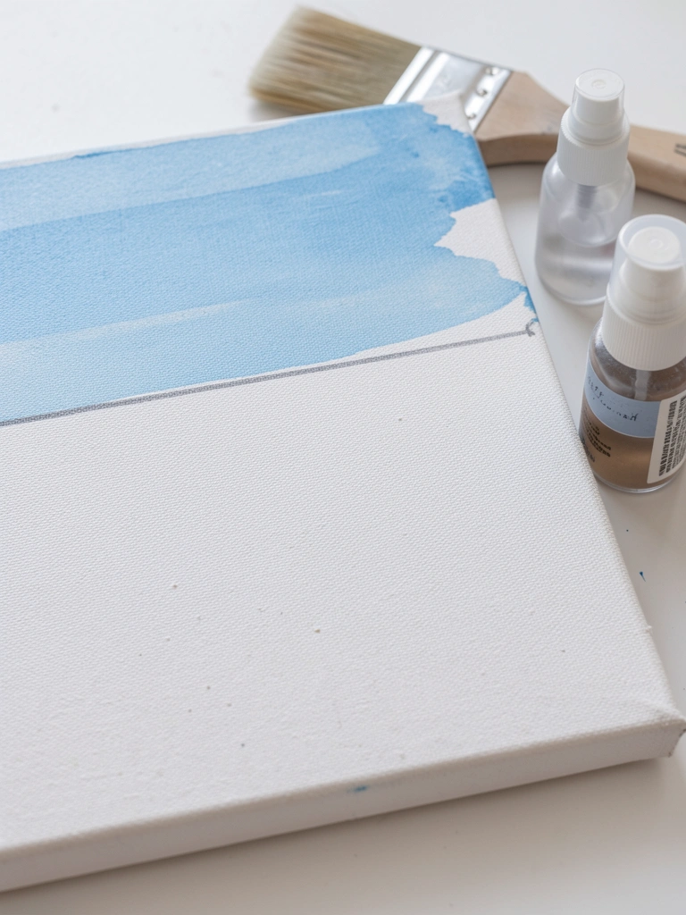
Start by lightly sketching the horizon and deciding where the clouds will sit. I usually mark the horizon with a faint pencil line and a couple of loose shapes for cloud masses.
Then mix a very thin wash of the mid-sky color and block in the background with a large flat brush. Work top-to-bottom so the darker upper sky blends into a lighter lower sky.
Mine always looks patchy at this stage and that’s normal. What goes wrong here is overworking the wash into streaks; stop while it’s still slightly wet and tidy only obvious streaks. Tip: keep the wash thin and move quickly — use the spray bottle if the paint starts to tack.
Step 2: Paint the Sky Gradient Wet-on-Wet
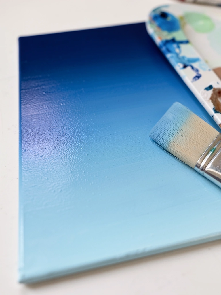
Mix two or three sky tones: a darker cool blue, a mid blue, and a warm pale near the horizon. Load your large flat and lay the darkest color at the top, blending down into the lighter mix while everything is still wet.
Work swiftly and use soft horizontal strokes. If the surface begins to tack, mist it lightly. When it’s right the gradient reads smooth and seamless.
A common problem is paint drying too fast and leaving hard bands. Catch that by keeping a bead of wet paint on your brush and blending each join immediately. Tip: a retarder helps, but don’t rely on it to cover slow work—plan your strokes.
Step 3: Mix a Cloud Palette and Decide Values
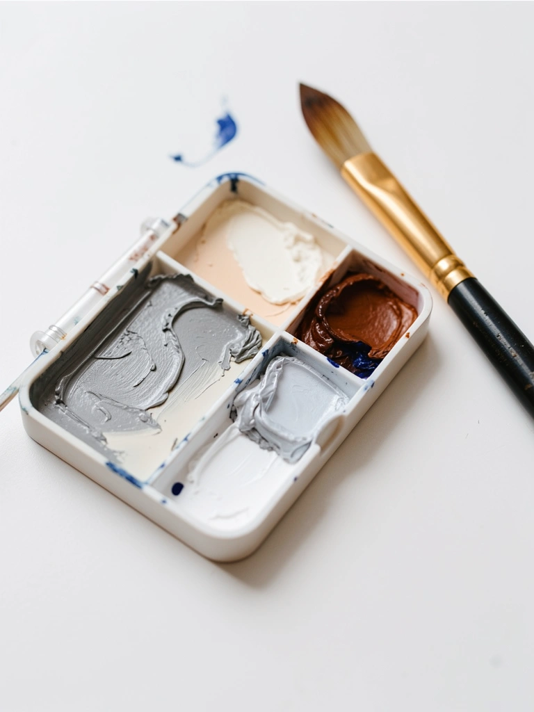
Before touching the sky, mix the values for cloud midtones, shadows, and highlights. I mix a range of muted grays by adding tiny amounts of ultramarine and burnt sienna into white. Make a cooler gray for shadows and a slightly warm gray for core volumes.
Lay out three values on the palette and test them on scrap. The clouds live or die by value more than color.
I used to make highlights too bright. That flattens form. What goes wrong here is overmixing into muddy gray—stop when you have clear separate chips of value. Tip: keep one nearly pure white for final highlights and a soft warm off-white for softer tops.
Step 4: Block the Cloud Masses with Soft Edges

Using your midtone, start painting the basic cloud shapes. I press with a filbert or mop, laying soft blobs where the clouds cluster. Think big forms first: bellies, domes, and separations of negative space.
Keep the edges soft by feathering with a clean, slightly damp brush or a soft mop while paint is wet. Don’t outline—push volume with value.
Mine looked patchy here the first few times and that’s fine. The main failure is pushing hard and creating harsh edges; catch it by stopping and softening edges immediately with a dry, soft brush. Tip: work in clusters rather than isolated puffs.
Step 5: Add Shadows and Midtone Layering (Glazing)

Once the midtones sit, deepen the undersides with thin, cool glazes to suggest depth. I mix a diluted cool gray and apply it in thin layers, letting each one dry slightly before adding another. Use soft circular strokes to blend transition areas.
Also add a slightly warmer midtone to the upper domes to suggest sun direction. Build contrast slowly—thin layers are forgiving.
The common mistake here is slapping on dark shadows and muddying the cloud. If shadows go too harsh, tone them back with a thin glaze of the sky color. Tip: keep shadow edges softer than you think; hard edges usually read wrong in soft skies.
Step 6: Apply Highlights, Refine Edges, and Final Adjustments

Finish by lifting small highlights with nearly pure titanium white where the light hits cloud tops. Use a small round brush and tap lightly, then soften the transition with a dry brush or a touch of the surrounding midtone.
Refine a few edges—reserve one or two crisp edges near the light source, but keep most edges soft. Step back often and squint to check values.
I often overwork highlights; that kills softness. The quick fix is to thin the next highlight layer and glaze slightly over the bright spot to integrate it. Tip: a final, very light glaze of sky color unifies the whole piece.
Common Mistakes to Avoid
- Painting highlights too early, then overworking them — wait until shadow layers are placed, then add highlights sparingly.
- Using pure black for shadows — use a muted mix (ultramarine + burnt sienna) to keep color harmony.
- Overblending until the forms disappear — preserve subtle edges by blending lightly, not erasing.
- Letting acrylics dry into hard bands — mist the surface and work in manageable sections, or use retarder.
- Mixing too many grays at once — keep 3 clear values on the palette to avoid muddying.
Final Thoughts
Be patient with the background. A smooth, even sky makes cloud work easier.
Accept the patchy stage. It almost always resolves as you glaze and add highlights.
You won’t copy the photo exactly on your first try, and that’s fine. Keep these steps handy and paint a few small skies to build confidence.