15 Inspiring Pottery Painting Designs
I used to smear underglaze and wonder why it turned muddy. I ruined a plate by overworking the rim.
Slow practice fixed that. Small drills, simple color choices, and forgiving surfaces helped.
Below are designs I actually painted, messed up, and learned from. They’re practical and usable on pottery.
15 Inspiring Pottery Painting Designs
These 15 designs are ones I paint at the wheel or on bisque. They’re practical, photo-ready, and tested. Each idea stands on its own so you can try one at a time.
1. Layered Underglaze Washes for Soft Backgrounds
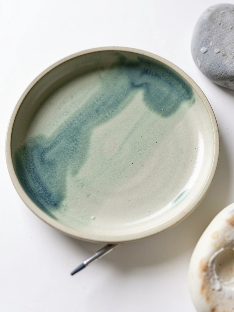
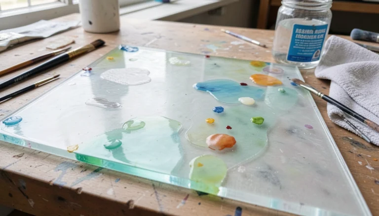
I started using thin underglaze washes when my backgrounds were always streaky. Thinning with a bit of water and applying two thin layers cured that. The result looks soft and balanced, not flat.
I watch drying times. If I paint the second layer too soon, it lifts; too late and it sits on top. I learned to let the first layer dull slightly.
Pay attention to pigment load. A heavy hand makes blotches. I keep a wet sponge handy for gentle feathering.
What You'll Need for This
- Bisque pottery
- Underglaze or thinned acrylic
- Soft round brush
- Small sponge
- Water container
2. Sgraffito Lines over Underglaze Layers
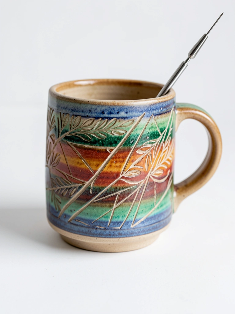
I loved the clean contrast sgraffito gave my patterns. I paint a colored underglaze, let it dry past tacky, then carve lines with a needle tool. The carved lines read sharp after firing.
My early mistake was carving too soon and smudging. Waiting until the underglaze is leather-hard saved the design. It’s forgiving, but the timing matters.
Keep your tool sharp and steady. A light hand makes delicate marks that survive glazing and firing.
What You'll Need for This
- Bisque pottery
- Underglaze
- Needle tool or sgraffito tool
- Small sponge
- Soft brush for cleaning dust
3. Resist and Stencil Textures with Wax or Masking Fluid
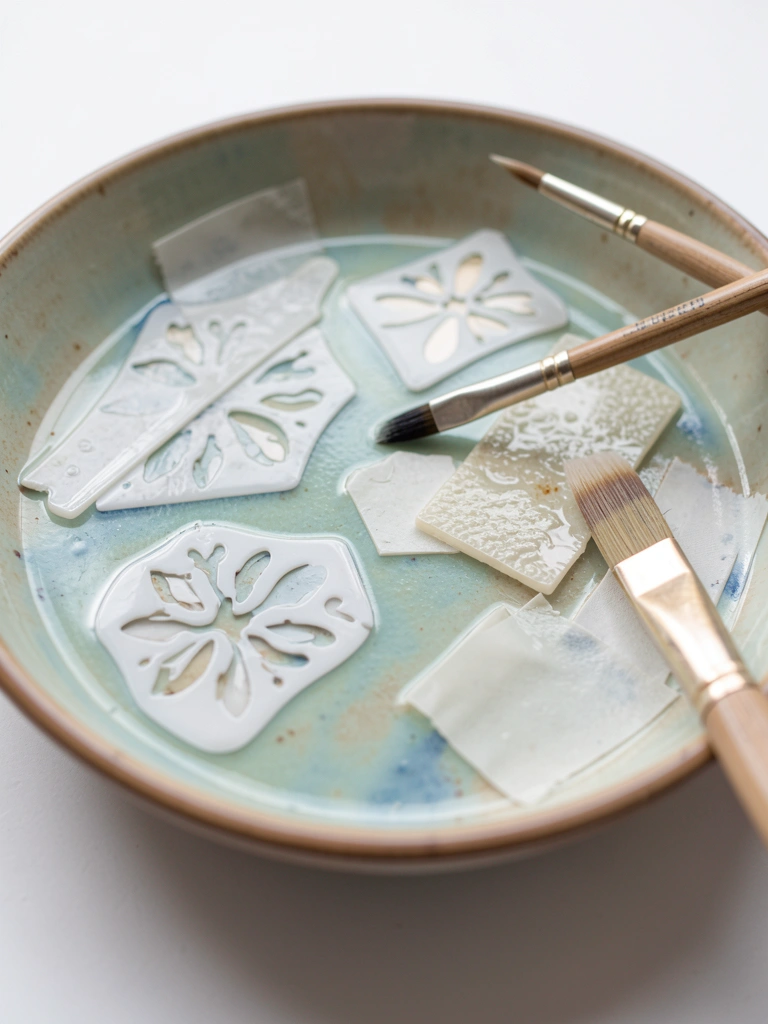
I started stenciling when freehand patterns looked wobbly. I apply wax resist or removable masking, paint over it, then peel to reveal sharp shapes. It made my motifs consistent across sets.
I once left the resist too long and had trouble removing it. Short bursts of application and test pieces helped me find the timing.
Stencil edges need a firm press. Loose edges leak. I press, paint thin layers, and lift carefully.
What You'll Need for This
- Bisque pottery
- Wax resist or masking fluid
- Small flat brush
- Paper stencils or vinyl
- Tweezers for removal
4. Dry Brushing for Subtle Stone or Antique Effects
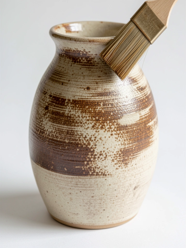
I used dry brushing after glazing to suggest texture without building thickness. Loading the brush lightly and wiping most paint off creates thin, broken strokes that read like stone.
I once overdid it and made the piece look dusty. Less is better. I step back after one pass and decide if another is needed.
Use a stiff-bristle brush and a gentle hand. It’s quick and forgiving for age effects.
What You'll Need for This
- Bisque or glazed pottery
- Thicker-bodied acrylic or underglaze
- Stiff flat brush
- Paper towel or rag
5. Sponging for Organic, Mottled Surfaces
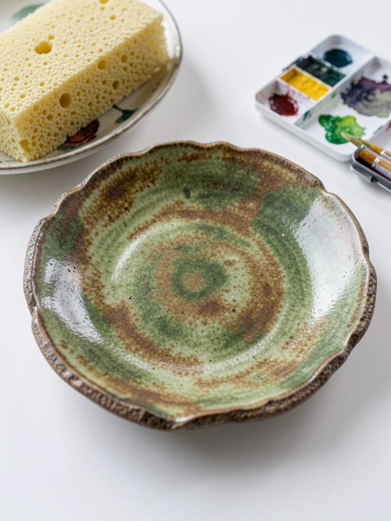
A sponge saved me when I wanted natural texture fast. I dabbed colors lightly, layered them, and built up depth. Sponging hides wobbly brushwork and gives an organic surface.
My first tries used too-dry paint and left harsh marks. Dampening the sponge and rotating it gave softer transitions. Pat in small circles for variety.
Keep paint thin. Too thick and it blobs. Clean the sponge often to avoid muddying.
What You'll Need for This
- Bisque pottery
- Underglaze or thinned glaze
- Natural sponge
- Palette or plate for mixing
- Water jar
6. Liner Brush Detailing for Fine Scripts and Flourishes
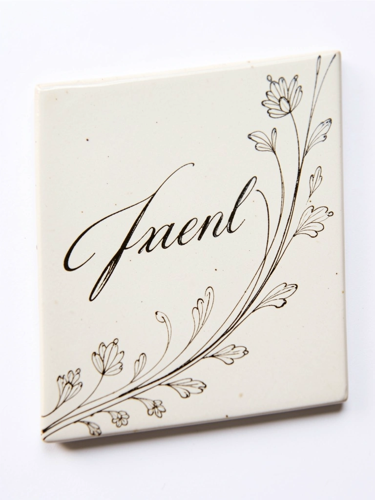
I learned control with a liner brush. Thin, steady lines give calligraphic motifs and delicate florals. I practice on spare tiles until my hand steadies.
The mistake was overloading the brush. It splattered. Now I load a small bead and reload for consistent lines. Short, confident strokes beat long, hesitant ones.
Wrist support helps. Rest your forearm on the table and move from the shoulder for smoother curves.
What You'll Need for This
- Bisque pottery
- Liner brush (size 0–2)
- Underglaze or ceramic paint
- Practice tiles or scrap bisque
7. Wet-on-Wet Blended Florals on Bisque
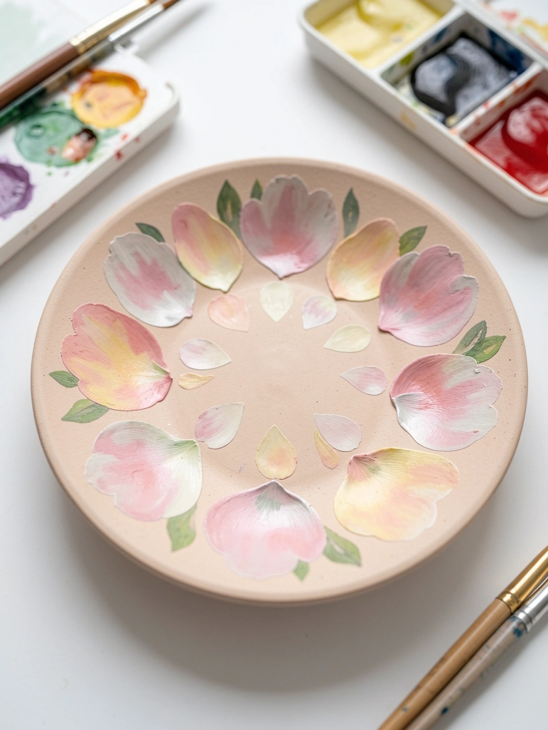
I tried wet-on-wet florals after watching a video and thought it’d be instant. It took practice. Working while the first paint is still tacky lets colors blend on the surface for soft petals.
My early petals bled into a mud patch. I learned to limit colors per petal and lift excess with a clean brush. Timing is key—too wet and it runs; too dry and it sits.
Start with two tones per petal. Keep a paper towel handy to dab mistakes.
What You'll Need for This
- Bisque pottery
- Thinned underglaze or ceramic watercolor
- Soft round brushes
- Water and paper towel
- Small palette
8. Marbling with Pourable Underglaze or Acrylic
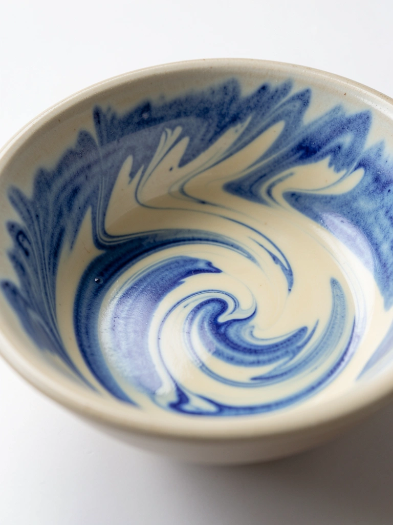
I loved marbling for big, graphic interiors. I pour thin underglaze colors and swirl with a stick. It’s messy but forgiving—small accidents often become interest points.
My first marble ran over the rim and caused crawling in the kiln. Now I tape and pour inside the taped area. I also thin colors to the same viscosity to avoid dominance.
Work quickly and test pour on a scrap tile to see how colors react.
What You'll Need for This
- Bisque pottery
- Pourable underglaze or fluid acrylic
- Stir sticks
- Masking tape
- Gloves and drop cloth
9. Geometric Tape Blocking with Clean Edges
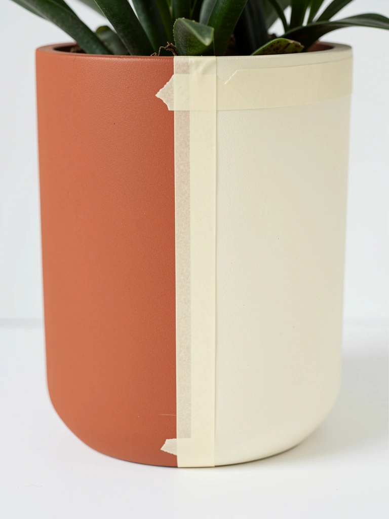
I use tape for modern, clean designs. Mask an area, paint thin coats, and peel when dry. It makes precise shapes and repeatable patterns across pieces.
My rookie error was peeling tape too soon and dragging paint. Patience fixed that. I wait until paint is dry to the touch but not brittle.
Press tape edges firmly. For curved surfaces, use small tape pieces for smoother lines.
What You'll Need for This
- Bisque pottery
- Painter’s tape
- Underglaze or acrylic
- Small flat brush
- Ruler or template
10. Spattering for Speckled Glaze Looks
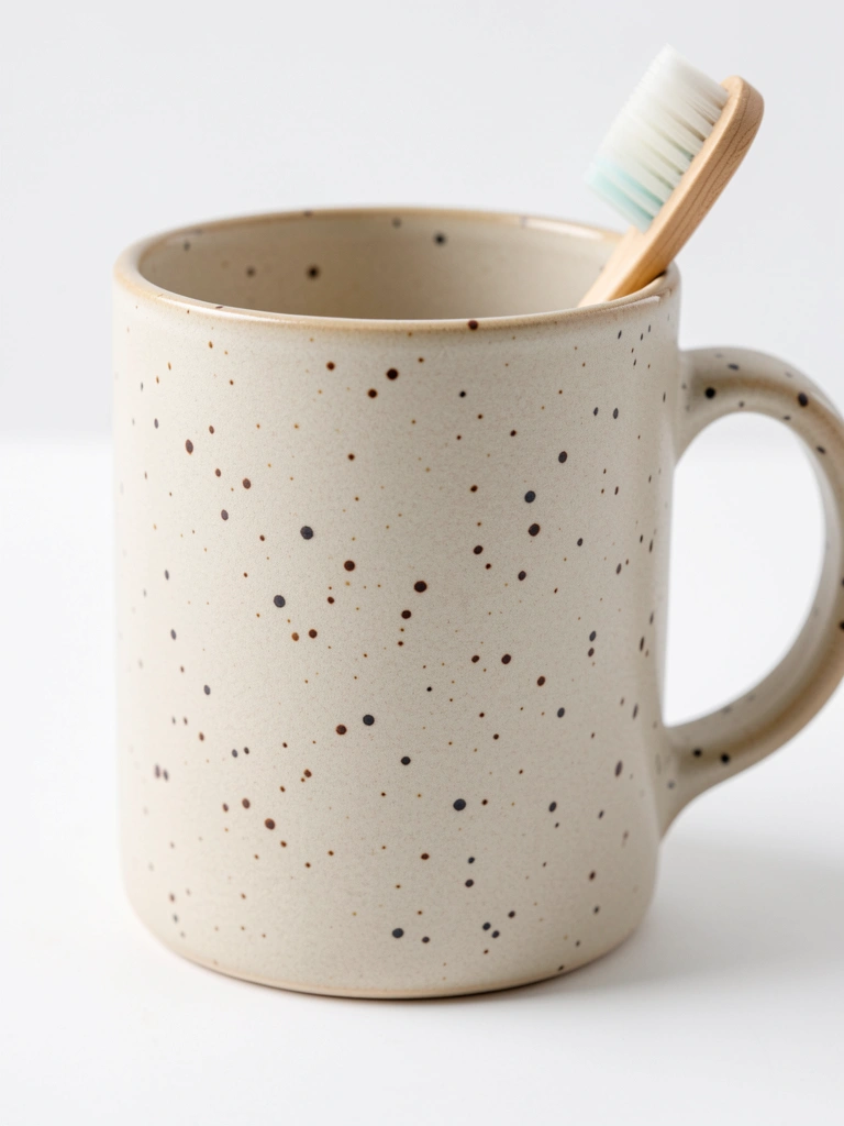
Spattering adds lively texture fast. I thin paint to a drippy consistency and flick it with a toothbrush or stiff brush. Small specks read like salt or sand.
I once over-spattered and had a muddy mess. I now practice on scrap and adjust dilution. Light, layered passes give control.
Wear gloves and protect surroundings. A little goes a long way.
What You'll Need for This
- Bisque pottery
- Thinned underglaze or glaze
- Toothbrush or stiff brush
- Protective covering
- Gloves
11. Palette Knife Texture on Thick Slip
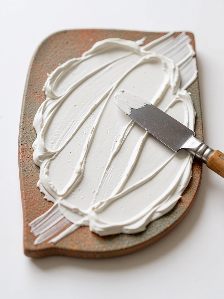
I used a palette knife when brushes flattened my texture. Applying thick slip with a knife creates raised strokes and visible direction. It photographs well and catches glaze differently.
I over-applied once and it cracked in firing. The trick is medium-thick layers, not heavy globs. Test thickness on test tiles to avoid crawling.
Use metal or flexible scraper knives and work confidently. The marks should be deliberate.
What You'll Need for This
- Leather-hard or bisque pottery
- Thick slip or heavy-bodied underglaze
- Palette knife
- Test tiles
12. Oxide Washes to Accent Carved Lines
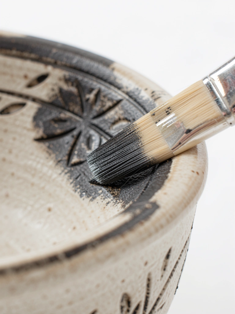
I mix metal oxides with water and wash them over carved or textured areas. The oxide settles in recesses and highlights carving without covering raised surfaces.
I once used a heavy oxide and it stained more than I wanted. I now dilute and wipe back gently with a damp cloth to control tone.
Oxide washes are simple and very forgiving. They add depth without complex glazing.
What You'll Need for This
- Bisque pottery
- Metal oxide powder or wash
- Soft brush
- Damp cloth
- Carving tool (if needed)
13. Layered Glaze Drips Controlled with Viscosity
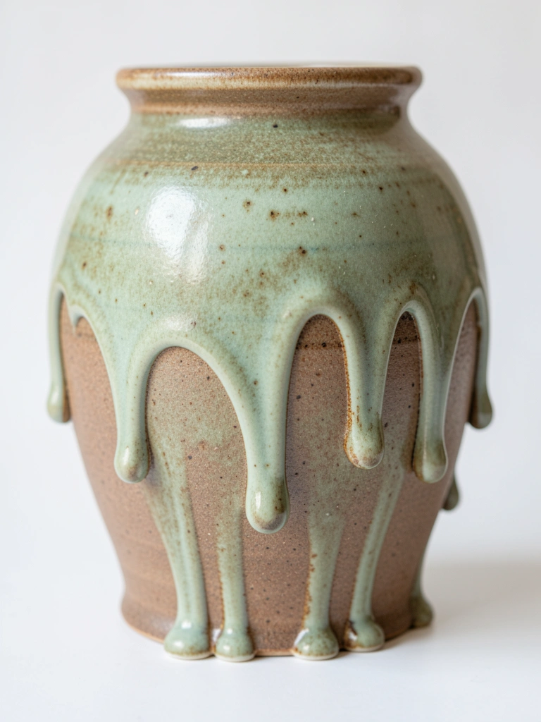
I learned to let gravity work but not ruin the piece. By adjusting glaze thickness I got slow drips that pool but don’t run off the edge. It gives a handcrafted, organic stripe.
My early pieces dripped over the kiln shelf. I now leave a dip in the foot and test viscosity on tiles. A kiln shelf saver is a must for experiments.
Apply thin layers and build to control the flow.
What You'll Need for This
- Bisque pottery
- Brush-on glaze adjusted for flow
- Small ladle or cup
- Test tiles
- Kiln shelf protector (if available)
14. Metallic Accents and Rubbed Highlights
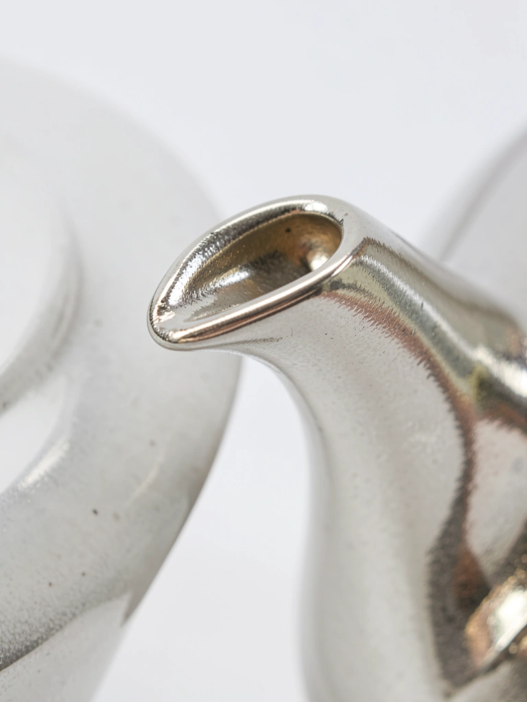
I add metallic luster sparingly. After firing, I rub a little luster or mica into raised bits for highlights. It reads like metal without heavy coverage.
I once applied too much and it looked garish. Now I use a dry brush and wipe until I see just a whisper of shine. Less often reads more elegant.
Be careful which lusters require firing. Read recommendations and test.
What You'll Need for This
- Glazed or bisque pottery
- Metallic luster or mica powder
- Soft dry brush or cotton pad
- Test piece
15. Practice Tiles and Value Studies before Full Pieces
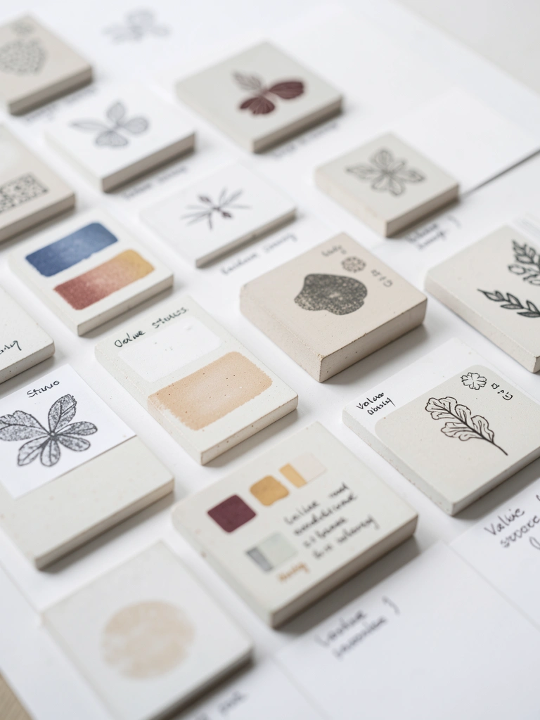
I stopped ruining big pieces when I committed to tiles. I paint small value studies and color swatches before the main piece. It saves wasted time and glaze.
My habit of skipping tests led to muddy results. Tests help me match firing changes and see how colors layer. I keep a stack of labeled tiles next to the wheel.
Treat tiles like experiments. They’re quick, honest feedback.
What You'll Need for This
- Small bisque tiles
- Underglaze and glazes
- Small brushes
- Marker for labeling
- Notebook for notes
Final Thoughts
I’ve ruined plenty to get here. That’s okay. Try one idea at a time and use tests.
You don’t need every tool. Pick a design, make a tile, and paint slowly. Confidence comes from practice and small wins.