10 Elegant Oil Painting Flowers Ideas
I ruined several canvases before I learned what a simple palette will do for a bouquet.
I mixed too many colours at once and got mud.
I redid backgrounds three times until a soft gradient finally read like space.
I write from that messy, useful experience.
10 Elegant Oil Painting Flowers Ideas
These 10 techniques are things I actually used at the easel.
They cut down my muddy mixes and saved wasted canvases.
They’re practical and ready to try.
1. Limited Three-Color Palette for Clear, Harmonious Blooms
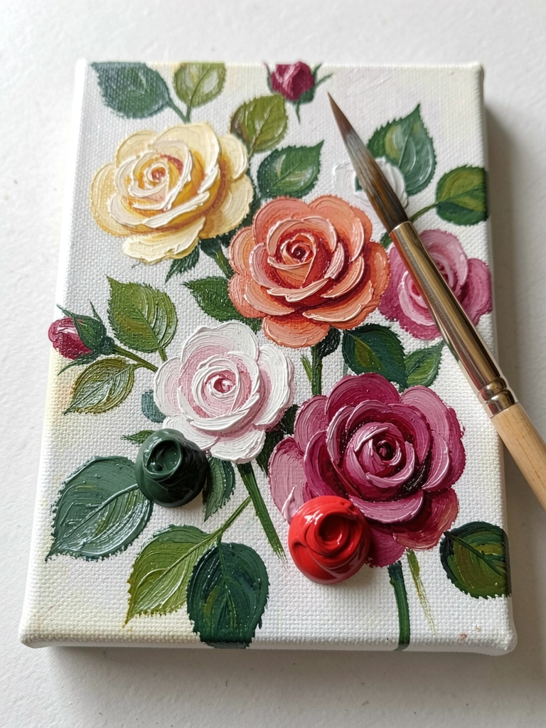
I started using a three-color palette when my mixes went gray.
I stuck to a warm red, a cool blue, and yellow with titanium white.
My colours stayed harmonious and predictable.
Before that, I’d add random greens and ruin the harmony.
I noticed paint behavior simplified. Mixing two of the three gave every stem and petal I needed.
My tip: make a small color chart on scrap canvas first. It saved me from losing a whole panel.
What You'll Need for This
- Three basic oil pigments plus white
- Scrap canvas or toned paper
- One medium filbert brush
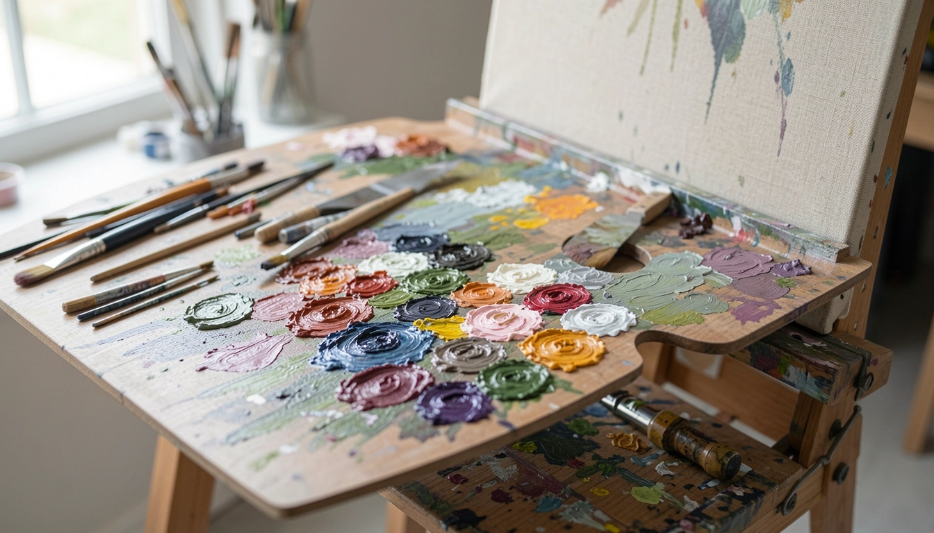
- Palette and palette knife
2. Thin Burnt-Umber Underpainting to Lock Values Early
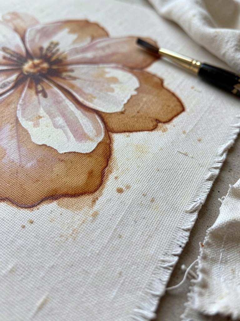
I paint a quick burnt-umber underpainting to read values before color.
It revealed weak compositions fast.
My petals learned where the darks and lights belonged without committing to color.
The paint sits differently over a dry underlayer. I could judge contrast and stop overworking.
What to notice: keep the underpaint thin or the top layers won’t sit well.
My honest mistake was leaving it too thick once. The final paint slid and blended oddly. Thin washes fix that.
What You'll Need for This
- Burnt umber or similar earth tone
- Medium (turpentine or odorless mineral spirits)
- Rigger or small round brush
- Linen canvas or primed panel
3. Alla Prima Petals — Wet-on-Wet for Lively Edges
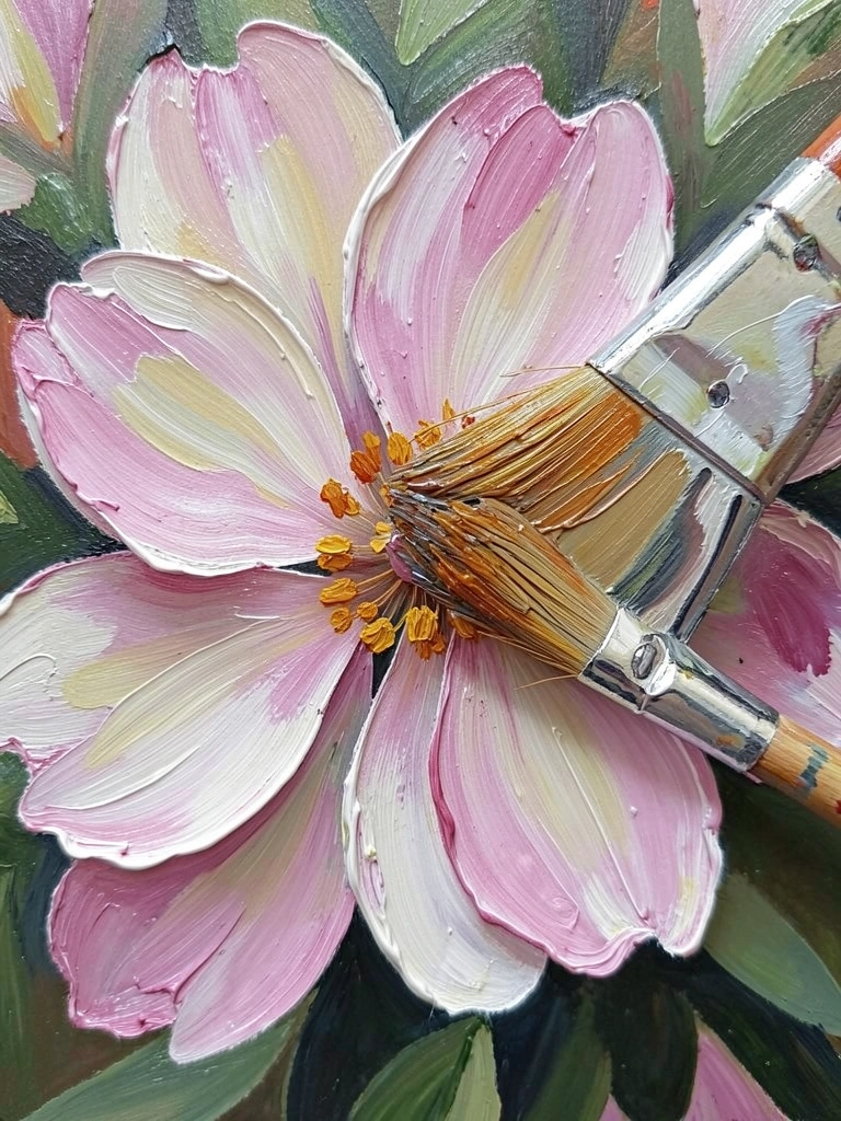
I learned alla prima by painting one rose in a single sitting.
Wet-on-wet kept the edges lively and soft.
My blending stopped looking smudged and began to read as petal planes.
I did make a lot of muddy gray the first few tries. I was pressing too hard and overstroking.
I noticed lighter touch plus thicker paint at the tips preserved color.
My tip: load the brush with a mixed mid-tone and float highlights quickly. Work confidently.
What You'll Need for This
- Medium-soft sable or synthetic brushes
- Medium viscosity oil paint
- A small jar of solvent for cleanup
- Sturdy easel and palette
4. Glazing Thin Layers for Depth Without Mud
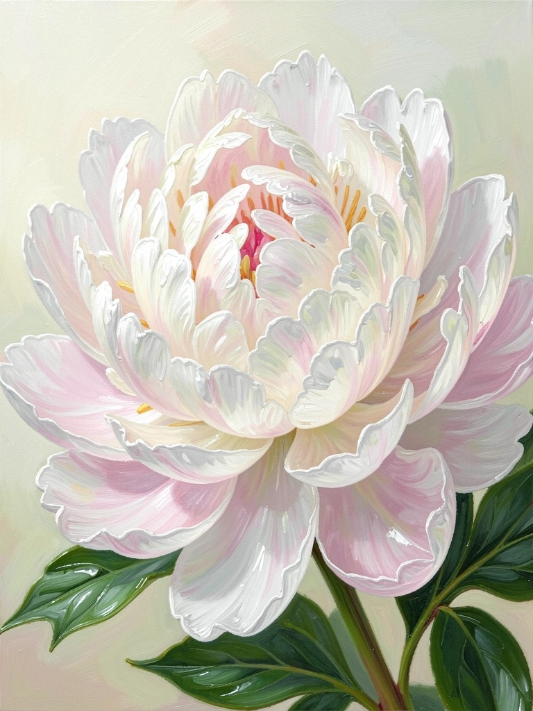
I glaze when I want petals to glow from within.
Thin transparent layers over a dry base add depth without muddying midtones.
My colors became richer without adding more pigment weight.
I watch drying times carefully. If the base isn’t dry, the glaze drags.
My practical tip: keep glazes thin and test on the corner of the canvas first.
A tiny misstep here gives a quick fix: lift with a clean rag while still tacky.
What You'll Need for This
- Oil medium for glazing (low-viscosity)
- Transparent pigments (alizarin, ultramarine, transparent oxide)
- Soft flats or filberts
- Clean rags
5. Palette Knife Highlights for Crisp, Textured Petals
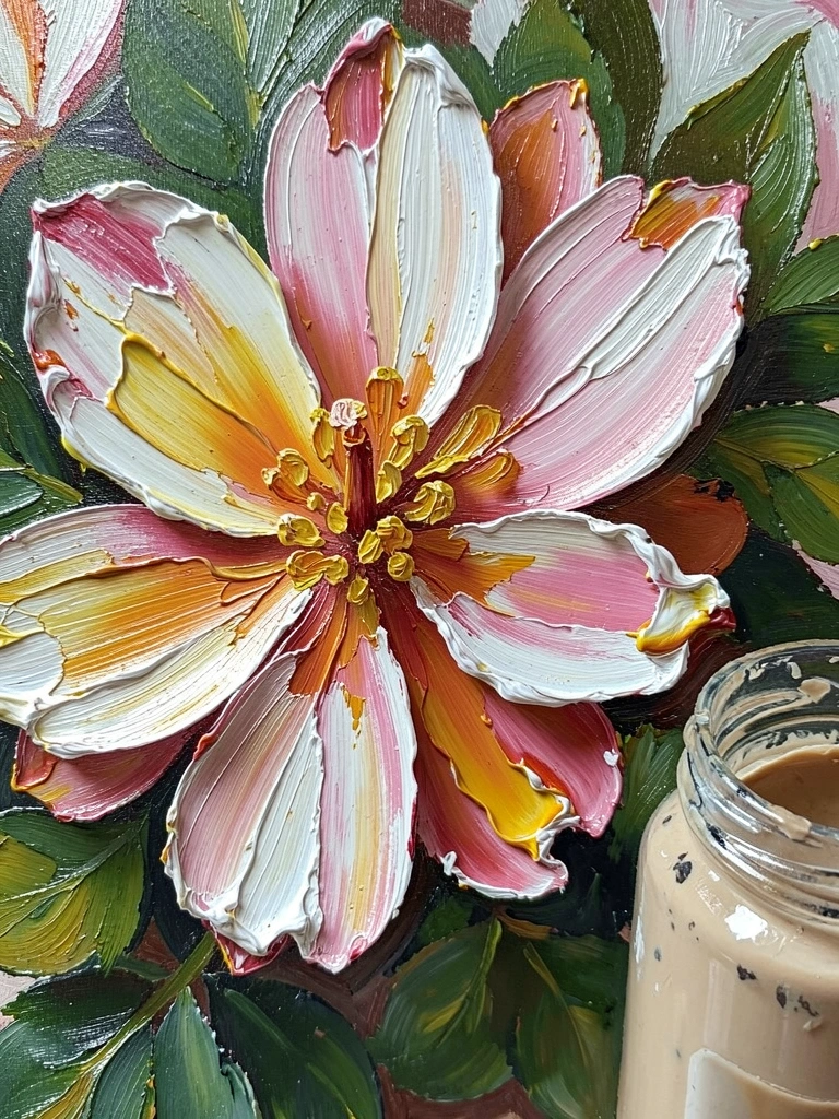
I started using a palette knife to catch light on petal edges.
The knife gave crisp highlights and avoided fuzzy brushwork.
My petals gained texture that photographed well.
I once smeared a thin area with the knife and tore the ground. That hurt.
My insight: only lay knife work over stable, dry-ish paint.
Tip: mix highlights slightly thicker than the base and press light. Less is often clearer.
What You'll Need for This
- Palette knife set
- Heavy body paints for highlights
- Steel or wooden palette
- Sturdy primed panel or canvas
6. Soft Background Gradients to Make Flowers Pop
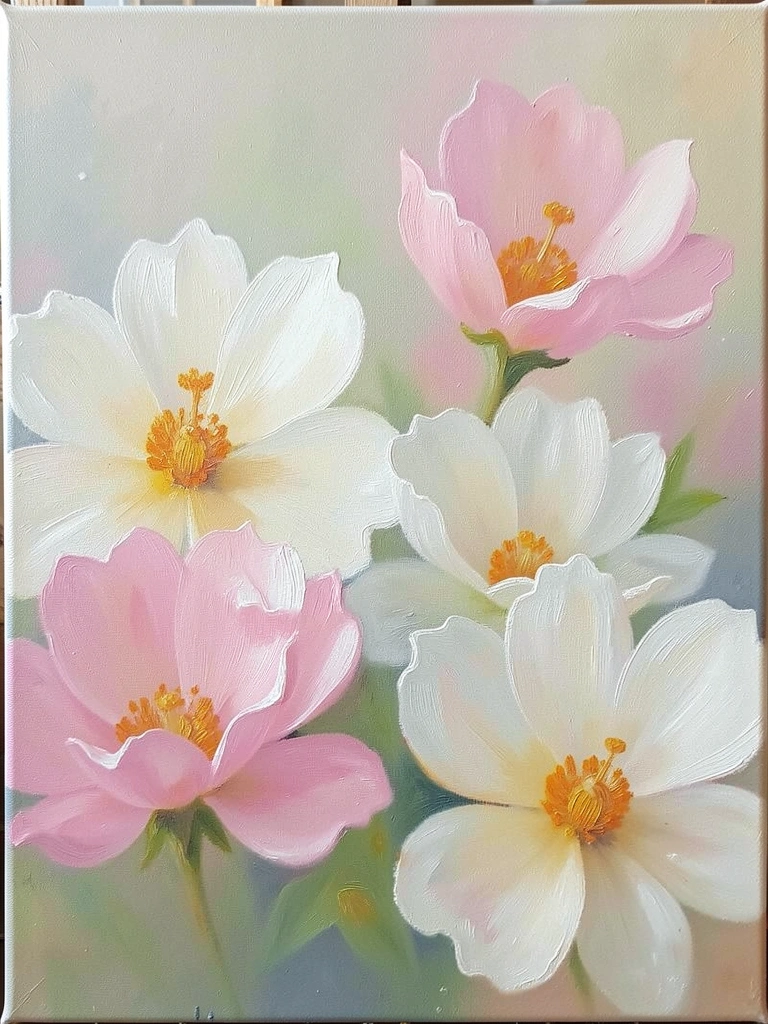
I redid backgrounds until I learned this: simple gradients create space.
A warm-to-cool wash behind petals keeps flowers readable.
My flowers stopped fighting the background for attention.
I lay the gradient first, slightly wet, and let it set to ‘skin tacky’. Then I place the bouquet.
My tip: mute the background value so the bloom reads. I often thin the paint with a little medium for smooth blends.
What You'll Need for This
- Large soft flat brush
- Thinned paint mixes
- Toned canvas or ground
- Clean solvent for softening edges
7. Scumbling for Soft Petal Textures and Correction
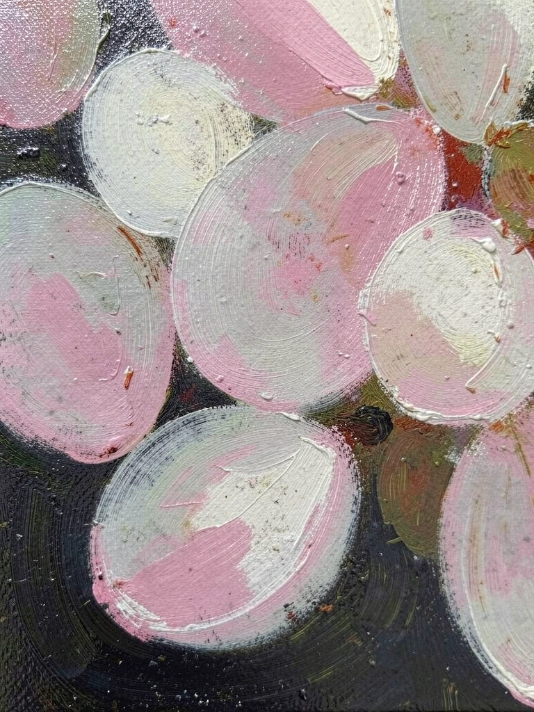
I use scumbling when petals need soft hazy edges.
A dry, lighter paint dragged over a darker layer creates that dusty petal feel.
My fix-ups began to look intentional instead of sloppy.
I once scumbled over wet underpaint and ended up with streaks. Lesson learned.
My advice: let the base tack slightly or dry. Work with a low-paint load and short, broken strokes.
The result feels delicate and forgiving.
What You'll Need for This
- Stiff, dry bristle brush
- Thinned light paint
- Riffled or rough canvas texture
- Scrap paper for testing
8. Blocking Shape with a Big Brush to Avoid Overworking
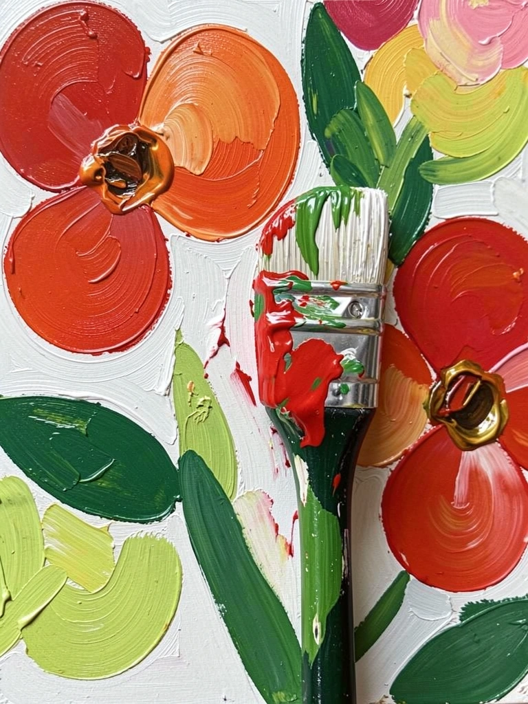
I block shapes with a large brush first.
This keeps the composition strong and stops me from fiddling in the details too early.
My paintings became more confident and less overworked.
I used to jump straight into tiny details and then paint looked stiff. Blocking forced a broader read.
My practical step: map lights and darks with one sweep. Then let layers refine.
I found restraint is easier with a bold start.
What You'll Need for This
- Large round or 1" flat brush
- Thinned mid-tone mixes
- Toned canvas or primed panel
- Palette knife for big mixes
9. Fine Center Details Last with a Rigger or Liner Brush
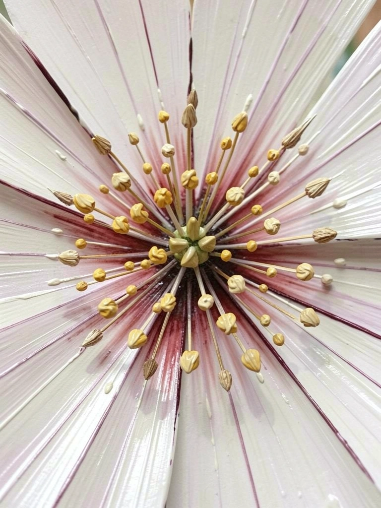
I leave the flower centers for the final pass.
Using a rigger brush for stamens gives believable scale and delicacy.
My small details finally read as natural instead of painted-on.
I once overloaded the rigger and made blotches. It’s easy to overdo thin lines.
My insight: thin the paint slightly and wipe off the tip between strokes. A steady hand matters more than a fancy brush.
Finish with a few bright dots. That often does the job.
What You'll Need for This
- Rigger or fine liner brush
- Thinned paint for lines
- Small palette for mixing glazes
- Toothpick or mahl stick for steadiness
10. Toning the Ground for Instant Harmony and Faster Results
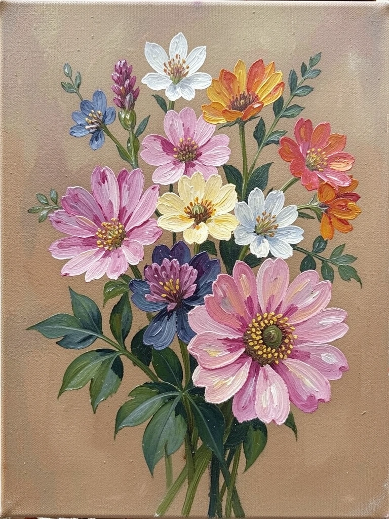
I tone my canvas before starting most flower pieces.
A warm or cool ground immediately sets the mood and helps values land faster.
My mid-tones stopped vanishing into the white.
I made the mistake of using a ground too dark once. It swallowed my lights.
My routine: pick a ground within the value range of the final painting. It saves time and keeps harmony.
I often wipe back a small highlight after the tone for crisp edges.
What You'll Need for This
- Thin wash of burnt sienna or gray
- Soft rag or brush for wiping
- Primed canvas or panel
- Small jar of solvent
Final Thoughts
I’ve learned to keep things simple at the easel.
Small habits—limited palettes, underpainting, finishing centers last—made my flower paintings calmer and more honest.
I don’t know everything. I do know that fewer wasted canvases mean more practice.
My encouragement: pick one idea and try it on a scrap. It helped me start again without the dread.