I ruined a few canvases with too-much pink and not enough plan.
I kept coming back to pink because it reads warm and forgiving.
Slowly I learned which pink moves are useful and which are showy thumbnails.

I’ll share what worked for me. Short, practical ideas you can try tonight.

## 7 Charming Pink Painting Ideas

These 7 techniques are hands-on and do-able.
I tested each one at the easel and kept what actually helped.
You’ll get clear steps and materials for every idea.

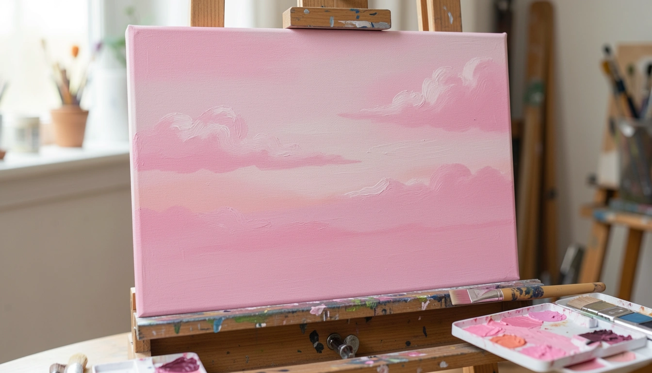
### 1. Layered Pink Sky with Wet-on-Wet Blending
I started over on skies a lot. My early blends went muddy when I scrubbed too long. Wet-on-wet changed that. I thin my paint slightly and lay the first wash quickly. Then I drag softer strokes while the layer is still damp.

This keeps edges soft and colors layered, not mixed into brown. I watch drying time closely. If it gets tacky, I stop and let it dry.

Tip: load the brush lightly and sweep, don’t scrub. Less work often gives you the softer pinks you want.

#### What You'll Need for This
- Acrylic or oil paint thinned for wet-on-wet
- Flat synthetic brush and soft fan brush
- Canvas or primed panel
- Rag or paper towel

### 2. Loose Pink Floral with Gesture Strokes
I used to overwork petals until they looked stiff. Then I tried loose gesture strokes. I aim for shape and rhythm, not perfect edges. A loaded round brush and quick movements made flowers read as flowers without fuss.

I let darker pinks sit under lighter highlights. That layering gave depth without overmixing. Sometimes a stray stroke stayed and improved the piece—so I learned to leave good accidents.

Before you start, sketch basic shapes lightly. Keep your hand loose and stop while it still feels fresh.

#### What You'll Need for This
- Acrylic or gouache
- Round mop brush and a small liner
- Canvas, paper, or board
- Pencil for light sketching

### 3. Monochrome Pink Value Study in Gouache
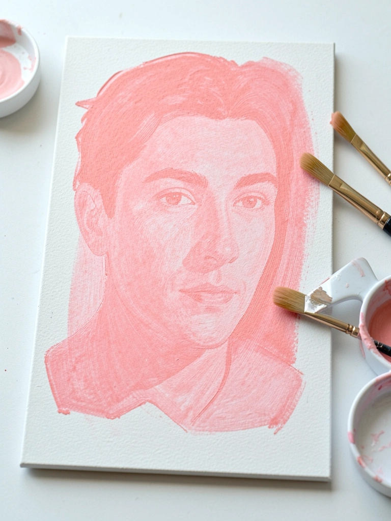
I painted a full portrait in one color to learn value. Using only pink taught me where to push contrast. Gouache handled well because it’s opaque and forgiving. I blocked mid-tones first, then pushed dark accents.

I made a mistake early by using too many tints. The piece flattened. I reworked it with stronger darks and clearer highlights. That fixed it.

If you’re shy about color, this is a safe practice. Focus on value steps and how each light or dark changes the face.

#### What You'll Need for This
- Gouache paints in a few pink tones
- Cold-press paper or illustration board
- Small flat and round brushes
- Palette and water cup

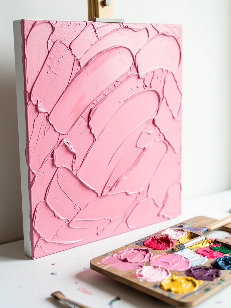
### 4. Thick Pink Texture with a Palette Knife
I overthinned paint for a while and missed texture. Using a palette knife brought physicality back. I mix a couple of pinks with a bit of heavy-body medium and apply in strokes and dabs.

This creates edges that catch light. I learned to stop adding color too soon; too many mixes made it muddy. I let separate layers dry a bit to keep colors distinct.

Start with a simple palette of three pinks. Work from thin to thick. The knife is forgiving if you plan your marks.

#### What You'll Need for This
- Heavy-body acrylic or oil
- Palette knife(s)
- Stiff paper or primed wood panel
- Disposable palette or wood palette

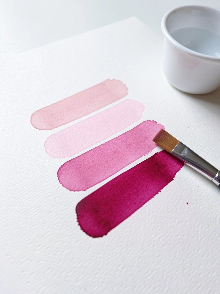
### 5. Soft Pink Gradient on Watercolor Paper
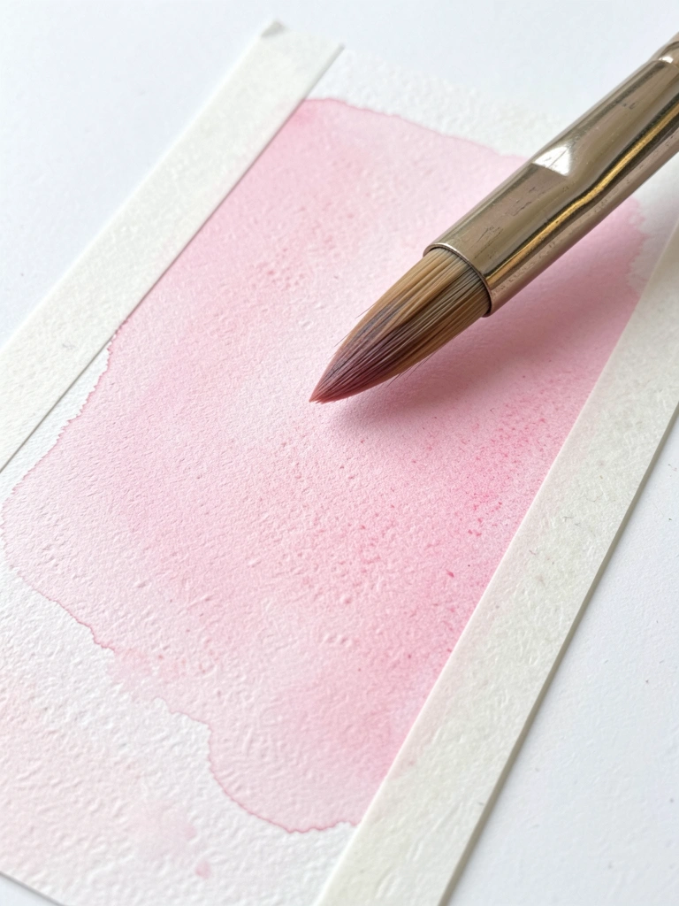
My first washes had hard bands where I stopped. I switched to a wet paper technique. I wet the paper first, then drop in graduated pinks and tilt the sheet gently. The colors bleed into each other naturally.

The trick was timing. Too wet and colors ran wild. Too dry and I got stripes. I practiced on scrap paper until I could read the surface.

Use a large wash brush and work fast. Let the paper set between attempts to avoid overworking.

#### What You'll Need for This
- Watercolor paints or heavily diluted acrylic
- Large wash brush (sable or synthetic)
- Cold-press watercolor paper
- Masking tape or board for tilting

### 6. Pink Underpainting for Warm Skin Tones
I started using a warm pink underpainting under portraits. It gives flesh a subtle glow without obvious pink on the surface. I block in values with thinned pink, then glaze skin tones over it.

I once left the underlayer too bright. It peeked through and looked like a rash. I fixed it by adding mid-value glazes and lowering contrast. The underpaint works best when slightly muted.

Keep the underlayer thin and focus on value relationships, not color saturation.

#### What You'll Need for This
- Thinned acrylic or oil pink
- Canvas or primed panel
- Flat and filbert brushes
- Glaze medium (optional)

### 7. Pink Accent in a Mostly Neutral Landscape
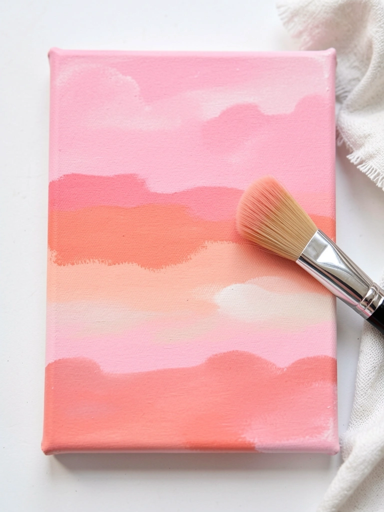
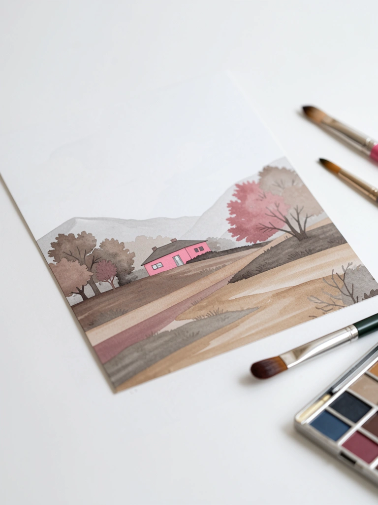
I used to slap pink everywhere. Now I pick one strong accent. A single rosy tree or rooftop reads clearer against muted greens and browns. The contrast makes the pink special and avoids muddy mixes.

I learned that the pink should match the scene’s temperature. A cool pink reads different than a warm coral. I once chose the wrong pink and it clashed badly. Replacing it with a grayed version fixed the harmony.

Test your pink on a scrap first. If it jumps, it will work as an accent.

#### What You'll Need for This
- Acrylic or oil paints in neutral palettes plus 2 pinks
- Brushes for landscape blocking
- Canvas or panel
- Small sketch or value study paper

## Final Thoughts

I don’t expect you to master all seven right away.
Try one or two that match what you already enjoy.
Pink is forgiving when you respect value and timing. Keep painting.